Columbia Brand Refresh
This project revolved around developing a conceptual brand refresh that better represented Columbia's brand voice; emphasis on the importance of adventure, exploration, and being out in the elements.
This refresh also aimed to align the brand's visuals more with landscapes found the Columbia River Gorge, the region of Oregon that inspired the creation and direction of the company.
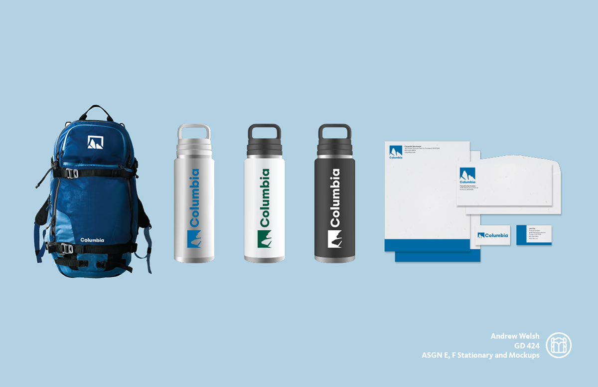
Deliverables included a logo and lockups, color palette, type treatment, mockups, and final stylescape.
The System
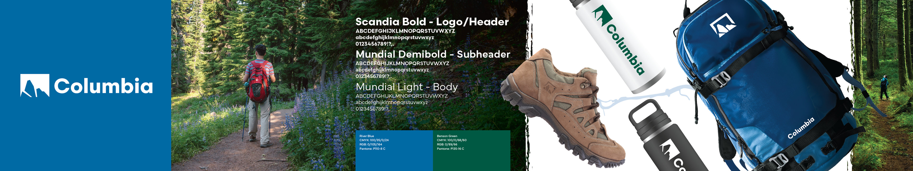
Final Printed, Wall Mounted Stylescape. 56 in x 10.5 in
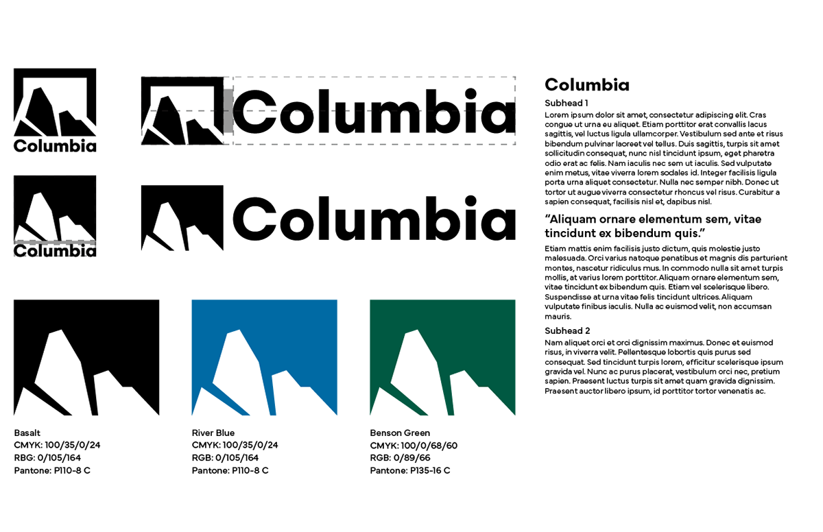
My design's pictorial mark is a simplified illustration of Beacon Rock, a popular hiking destination in the Columbia River Gorge. The intent of this mark is to communicate the past and origins of the company, and the endless possibility of adventure in the future. The brand colors in this refresh call back to the iconic features of the Columbia Gorge as well: Columbia Blue representing the river, and Benson Green representing both the lush forests and the Portland land-owner that historically set aside much of the area for preservation.
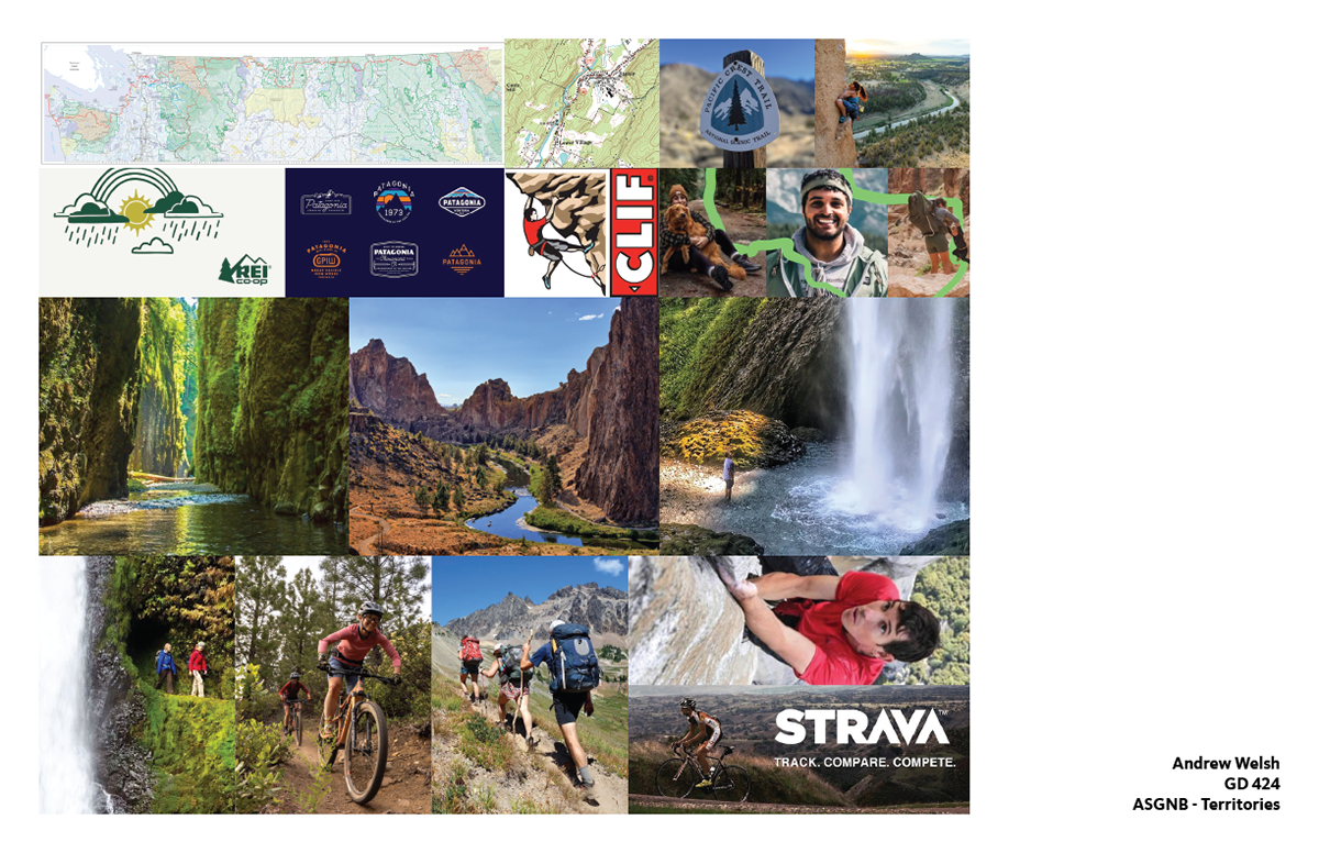
Process images
Moodboard
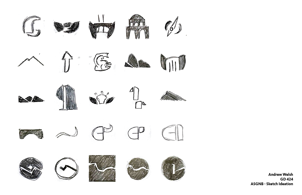
Logo Ideation
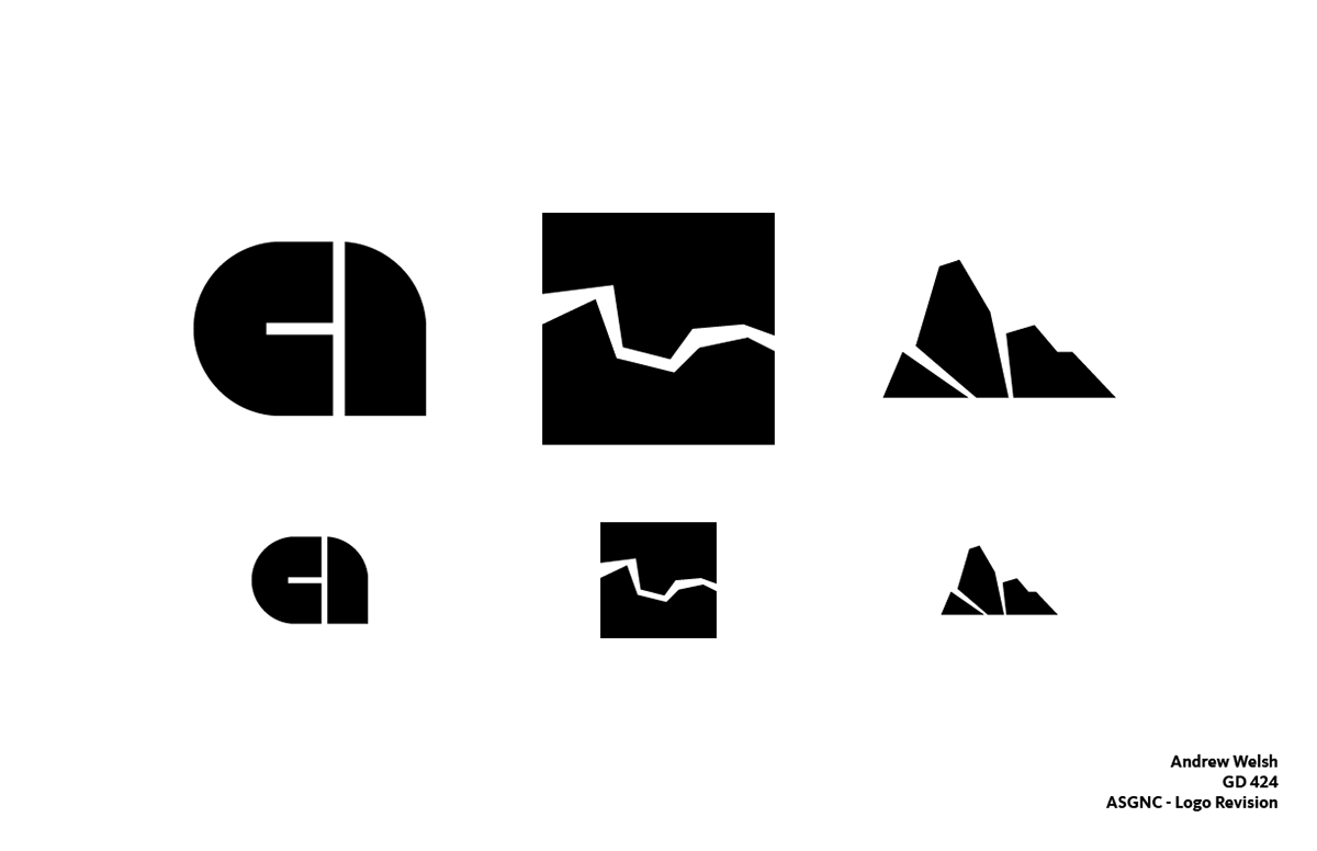
Logo Revision
Color and Type Progress