
Columbia Brand Refresh Concept
The goal of this project was to develop a hypothetical brand refresh for Columbia Sportswear. I chose to emphasize the brand position of adventure and ambition, as well as exploration of the elements, both in the Pacific Northwest, and beyond.
Deliverables included a brand refresh, including a logo, type and color palette, as well as mockups showcasing our designs, and final "stylescape" showcasing the refresh and a whole.
Process
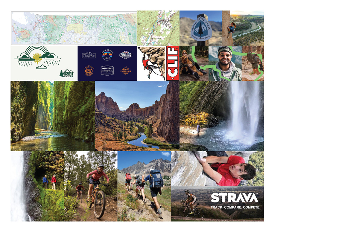
One of the important goals of this refresh concept was to really communicate the idea of ruggedness and adventure, while being clear and readable at the same time. After some mind mapping, mood boarding, and sketching out logo ideas inspired by the Pacific Northwest, I arrived at my initial logo concepts.
Each direction was informed by shapes found in the Columbia Gorge, the namesake of the company. The first idea was a waterfall coming off the letter C, the second was an abstraction of the river's course on a map, and the third was a simplified form of Beacon Rock, a popular hiking destination in the Columbia Gorge.
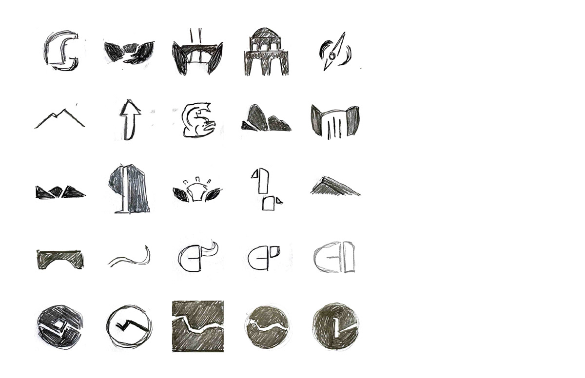
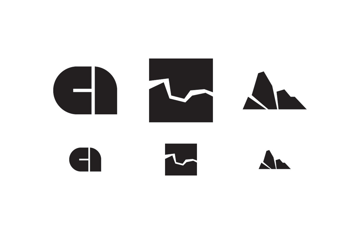
After several rounds of peer feedback, the Beacon Rock design was chosen. There was a consensus that that direction was the clearest design of the three, and evoked the feelings of ruggedness and ambition the most. From here, it was time to start assembling the full system.
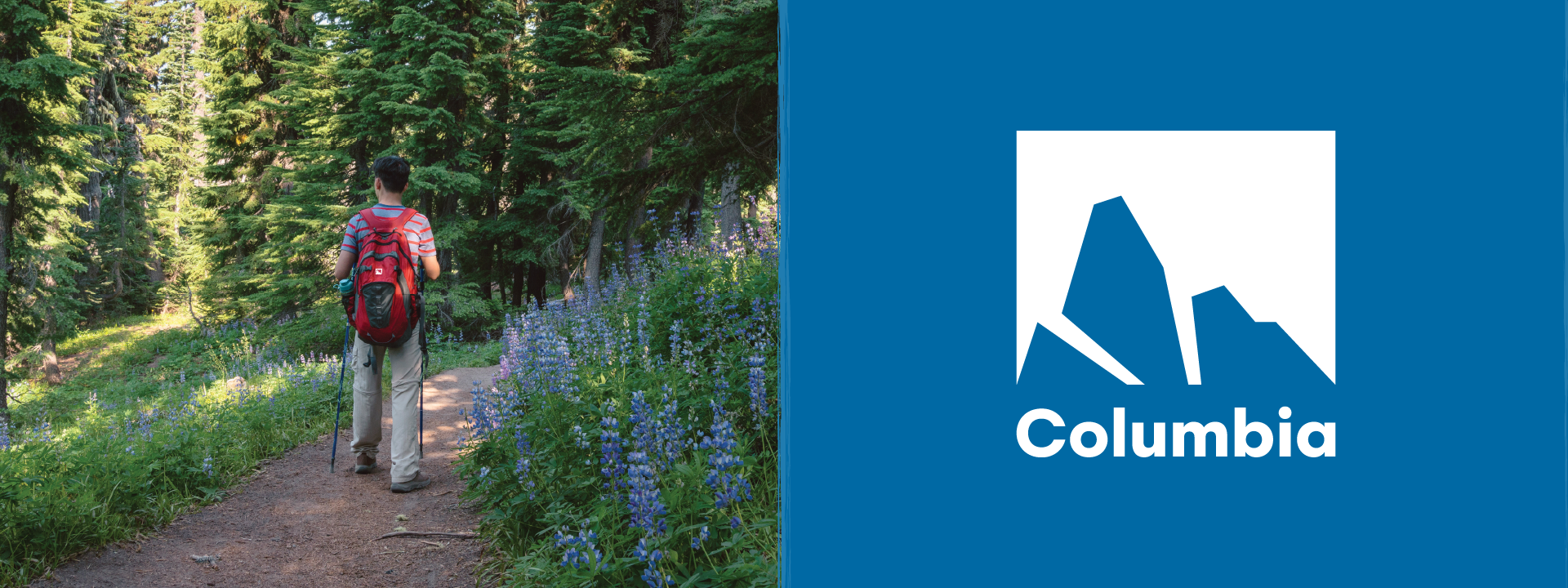
The colors of the system were inspired by the natural forms of the Columbia Gorge: the dark basalt rock, the blue of the river, and the green of the forests. Bold type was chosen to accompany the pictorial mark to further communicate the idea of boldness and adventure.
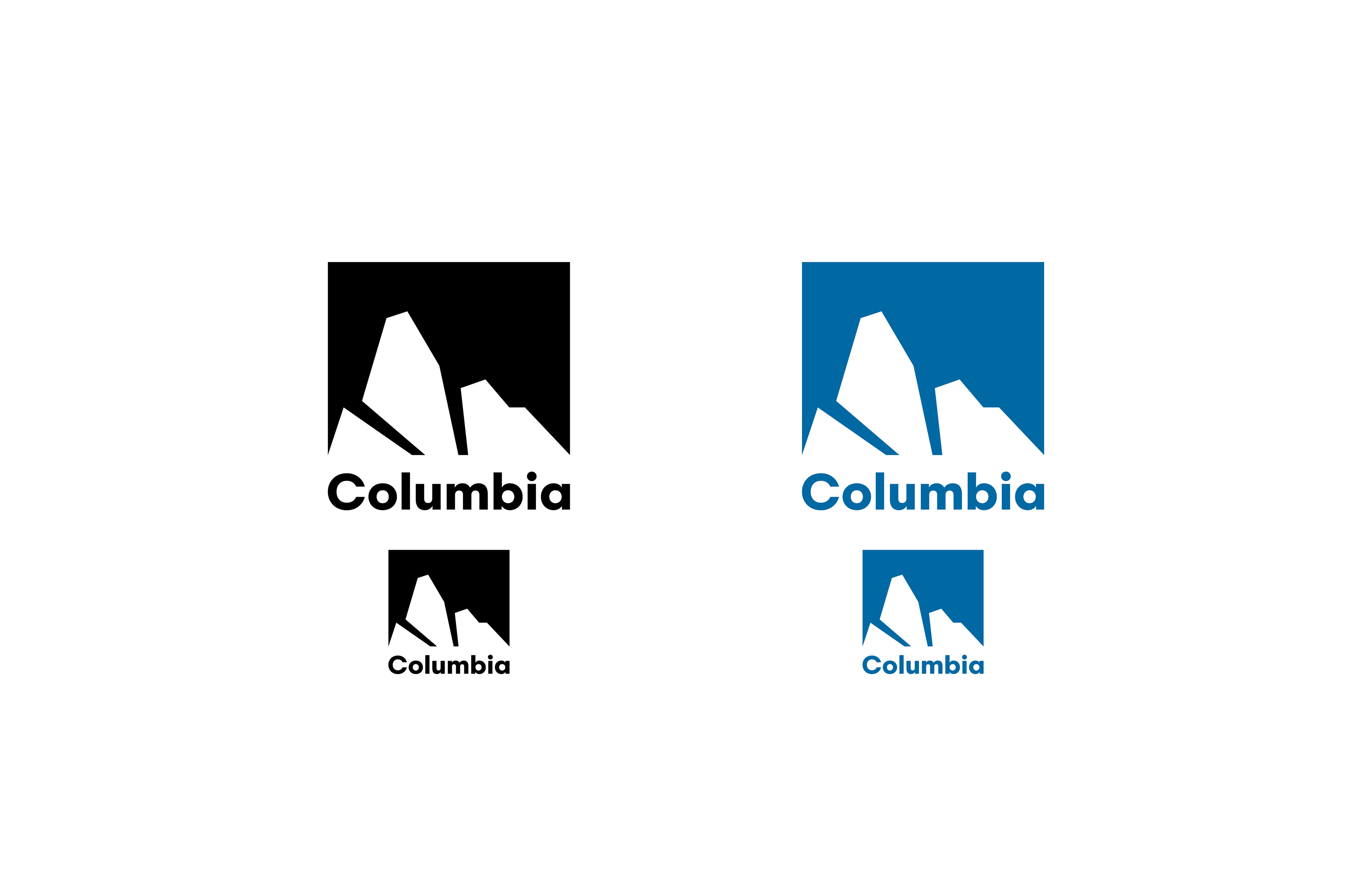
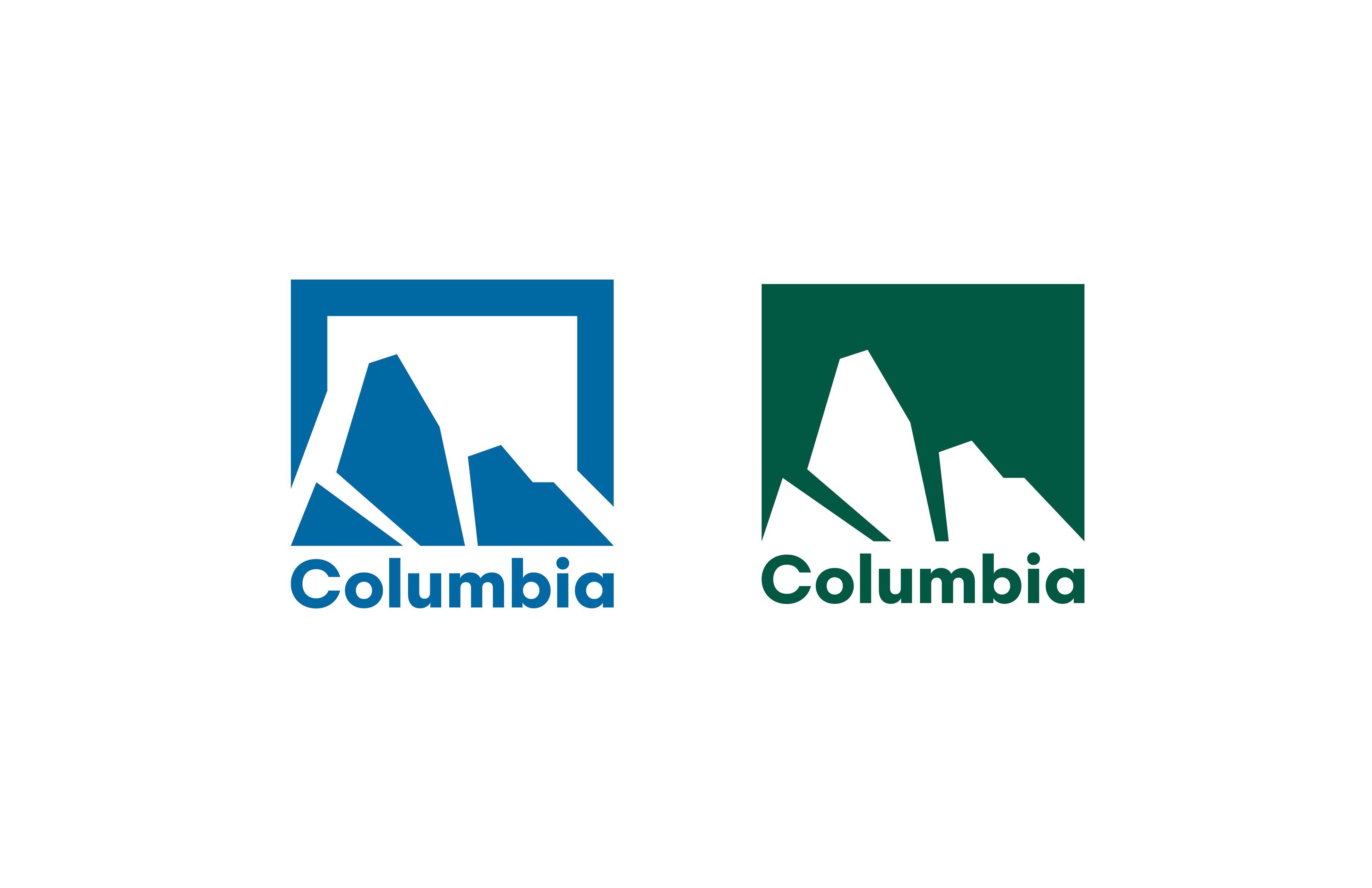
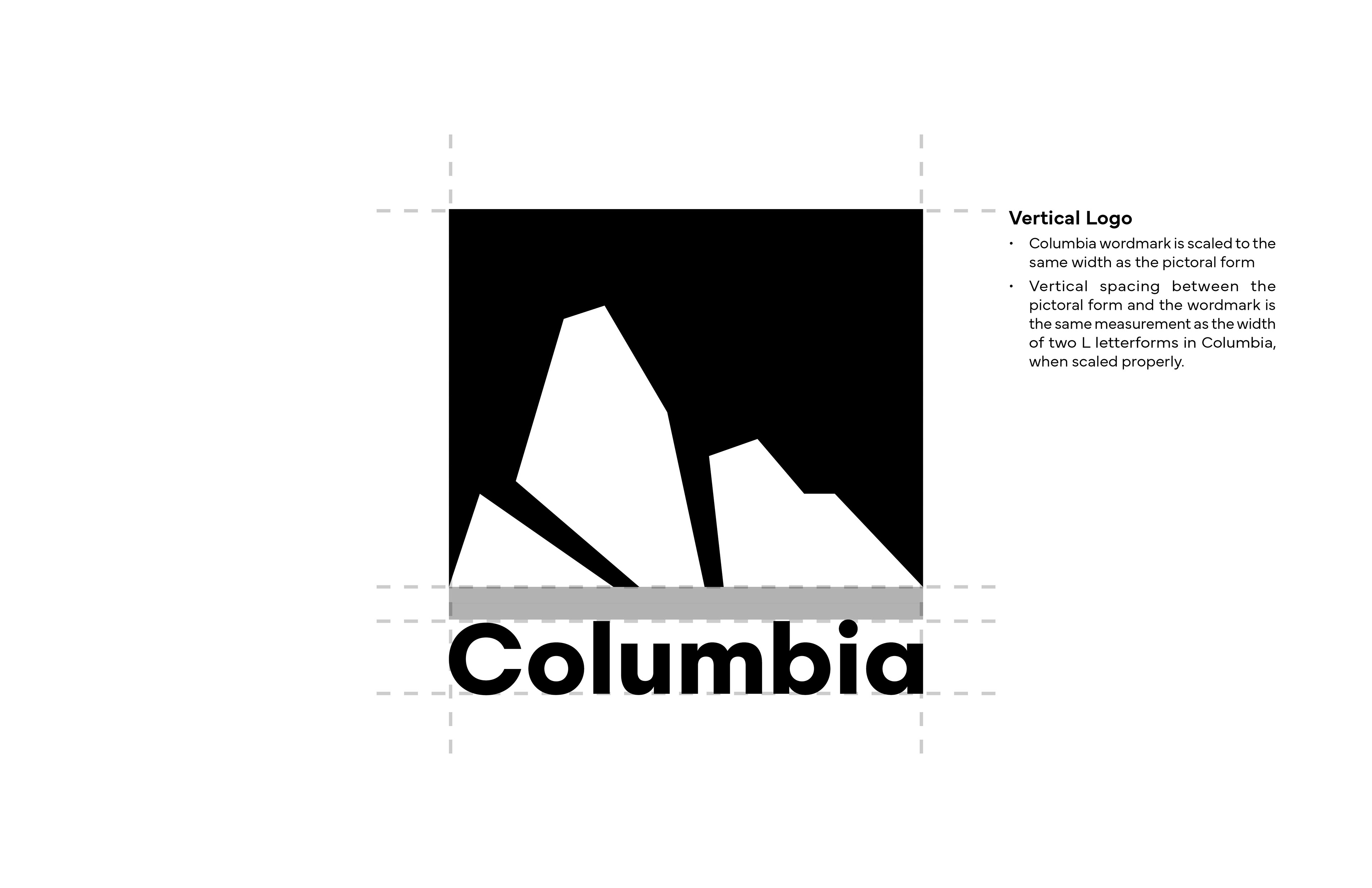
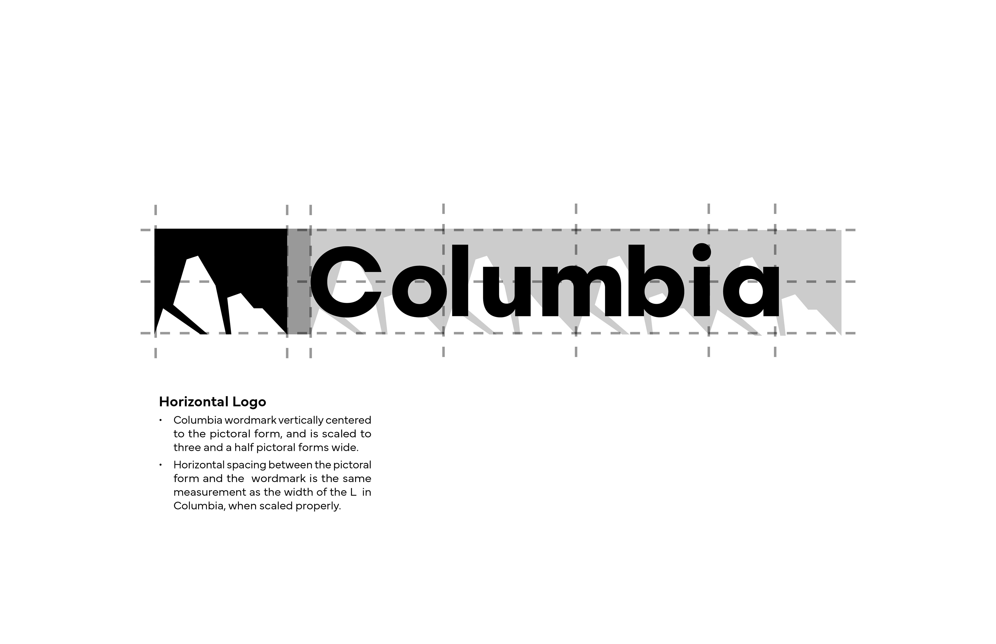
Other variants of the logo exist for different use cases. The standard cut out/negative space logo is supplemented by the positive space logo within a bounding box for use cases where the standard logo would be too visually heavy.
The System
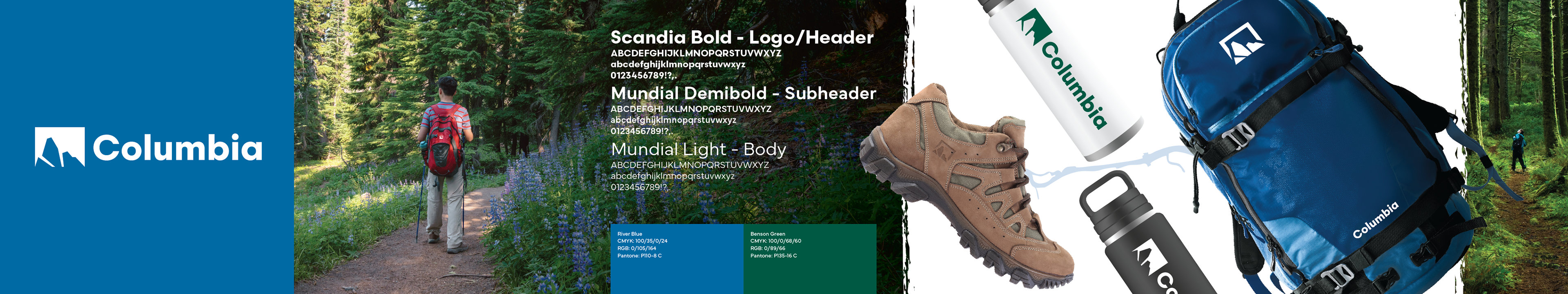
Final Printed, Wall Mounted Stylescape. 56 in x 10.5 in
The stylescape was the final deliverable for this project. After all of the aspects of the system had been assembled, the stylescape was meant to show off what the brand refresh would look like at-a-glance. The final stylescape uses nature photography, rough textures, and dynamic composition to convey the brand's new identity of boldness, ruggedness, and adventure.
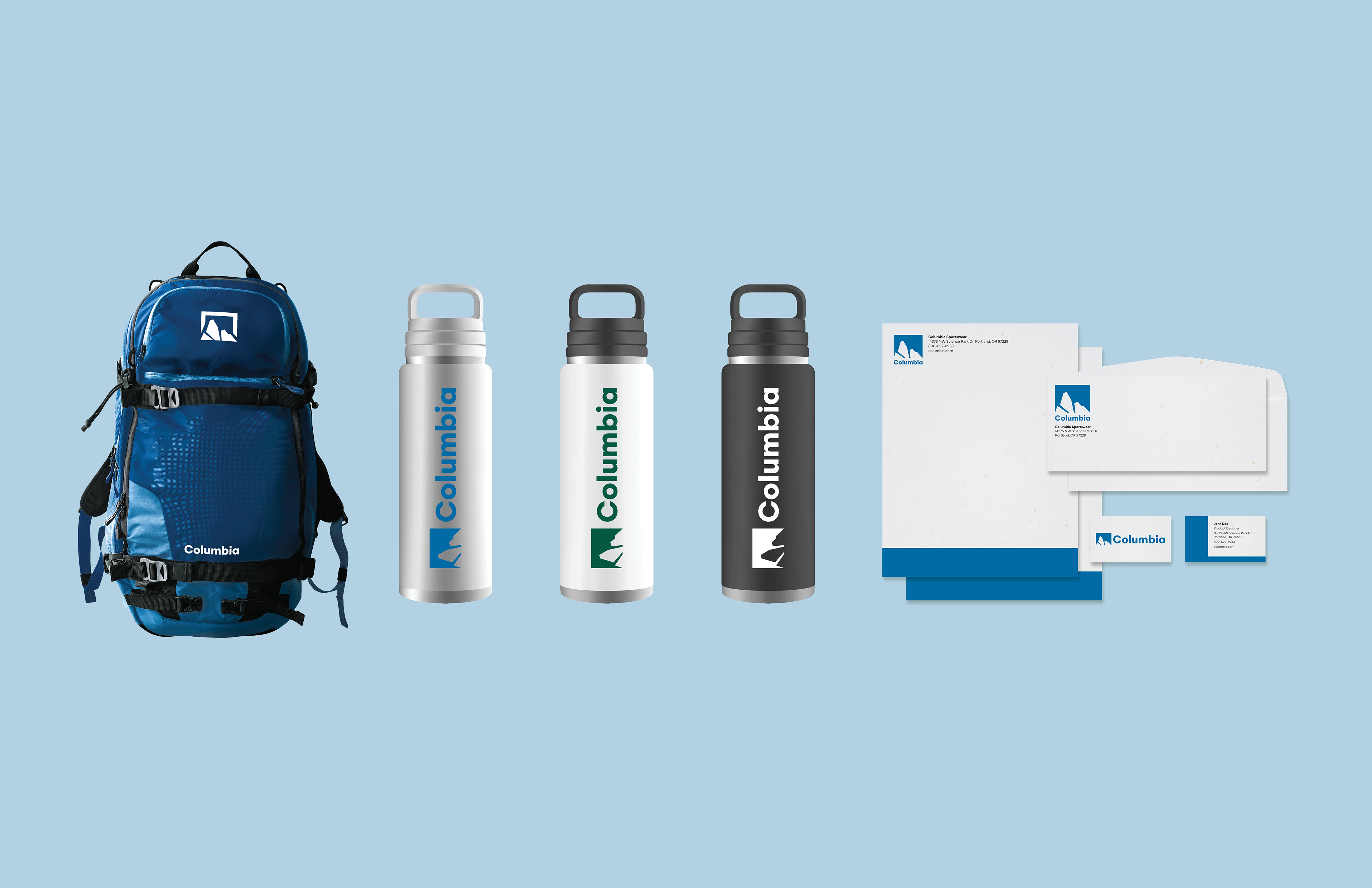
Mockups of product and stationery.