Left-Handed 'Squatch
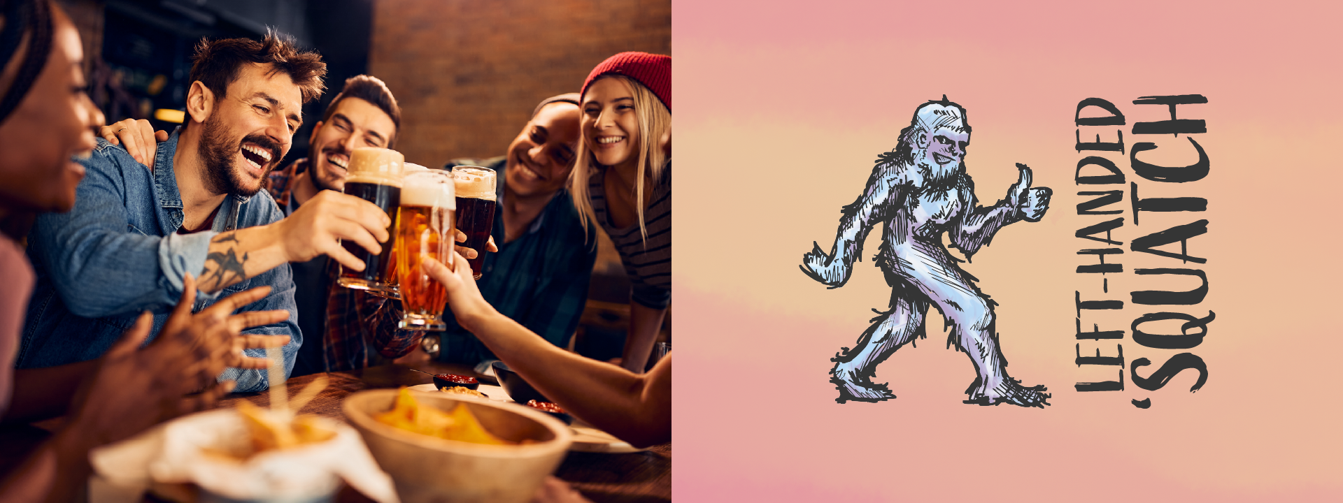
The goal of this project was to create branding for a fictional microbrewery located in Portland, Oregon. The brand was required to reflect the humor and wit of an older Gen-Z and younger Millennial target audience. Brand names were chosen from a bank of words; one adjective and one noun.
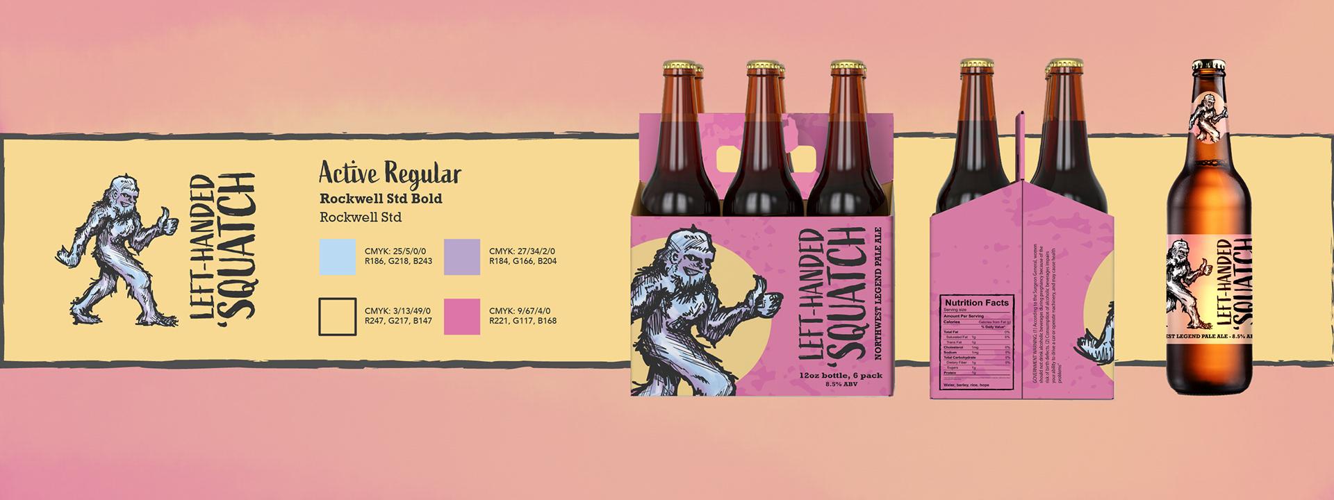
Deliverables included an identity system, and packaging design for a 12-oz bottle, as well as a 6-pack carrier.
Process
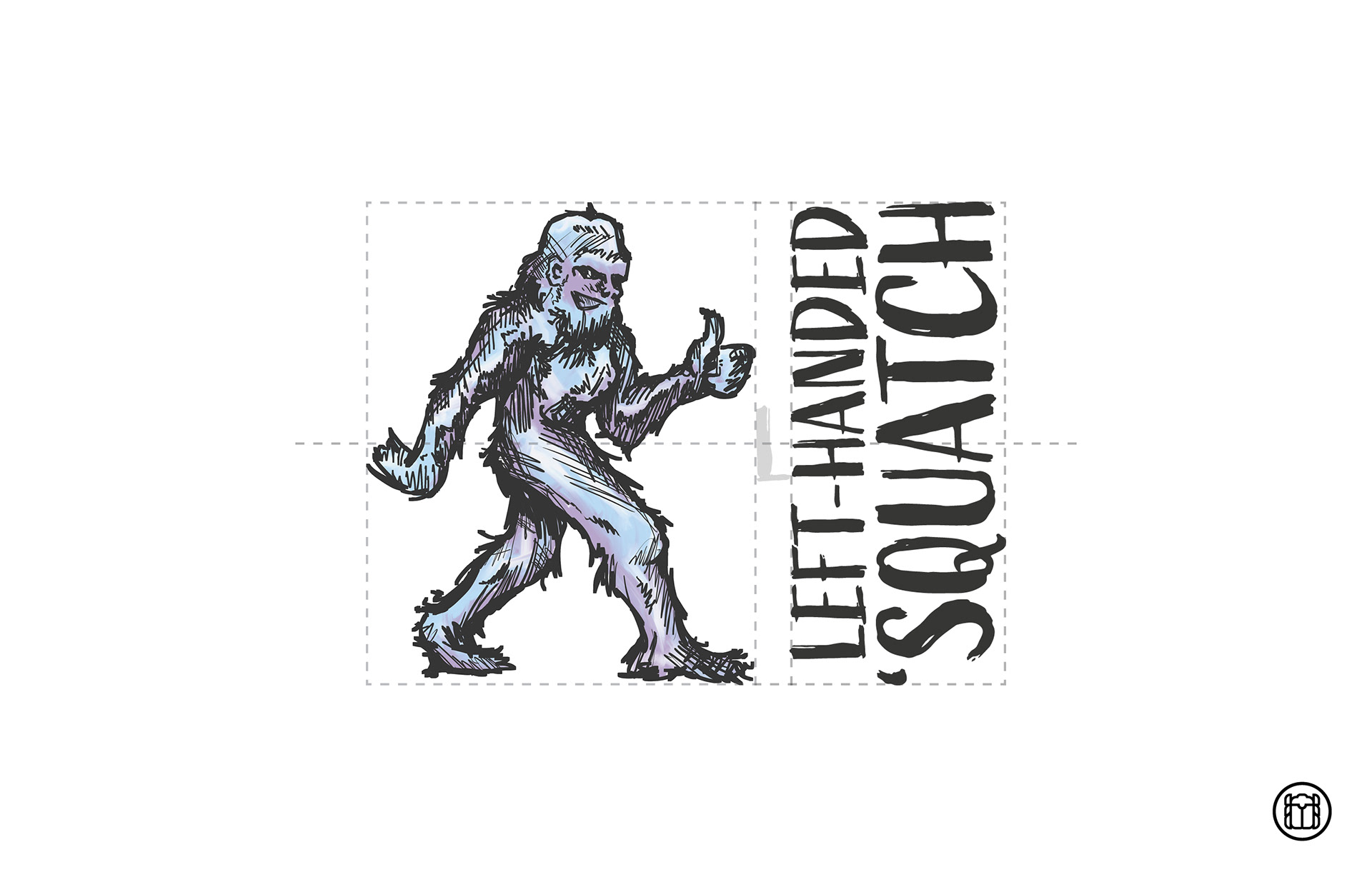
The adjective and noun that I chose were "left-handed" and "sasquatch". In my visual research, I found that rough line art illustration with a pastel/watercolor quality to it was common in modern fantasy illustrations, especially online. Wanting to lean into that style, I decided I would hand-draw a sasquatch for my logo, and pair it with a rough, handwritten quality type.

Moodboard Visual Research
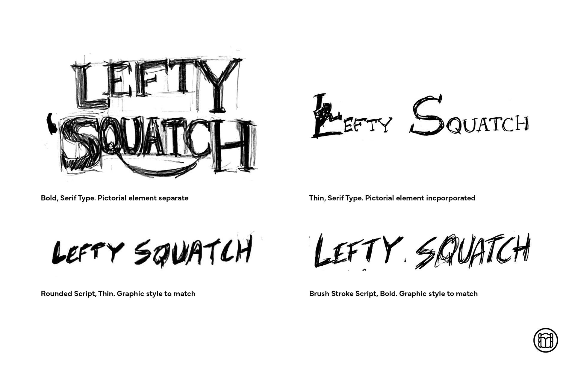
Wordmark Sketches
The final logo features a rough hand-drawn and pastel colored sasquatch in its famous stride pose, with a left-handed thumbs up. I didn't want either lockup to be too wide, as this had to be readable on a beer bottle, so for the horizontal lockup, I rotated the text vertical and placed it alongside the pictorial mark.
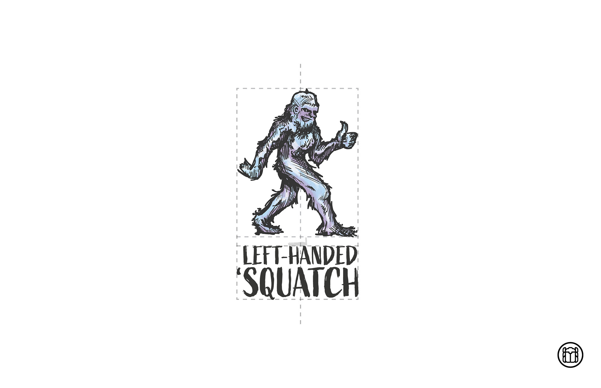
Vertical Lockup
Horizontal Lockup
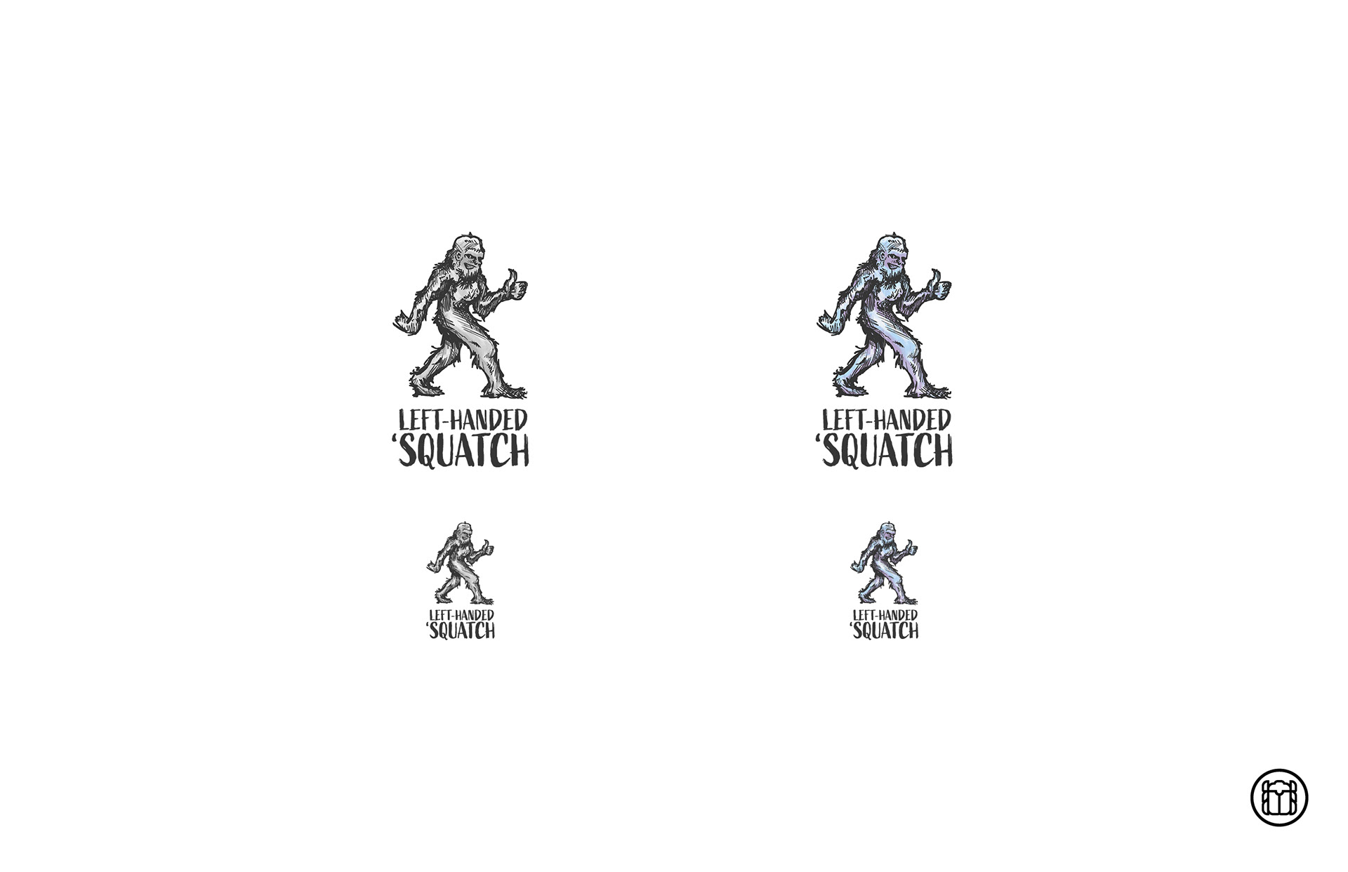
Black & White, Color, and Scalability
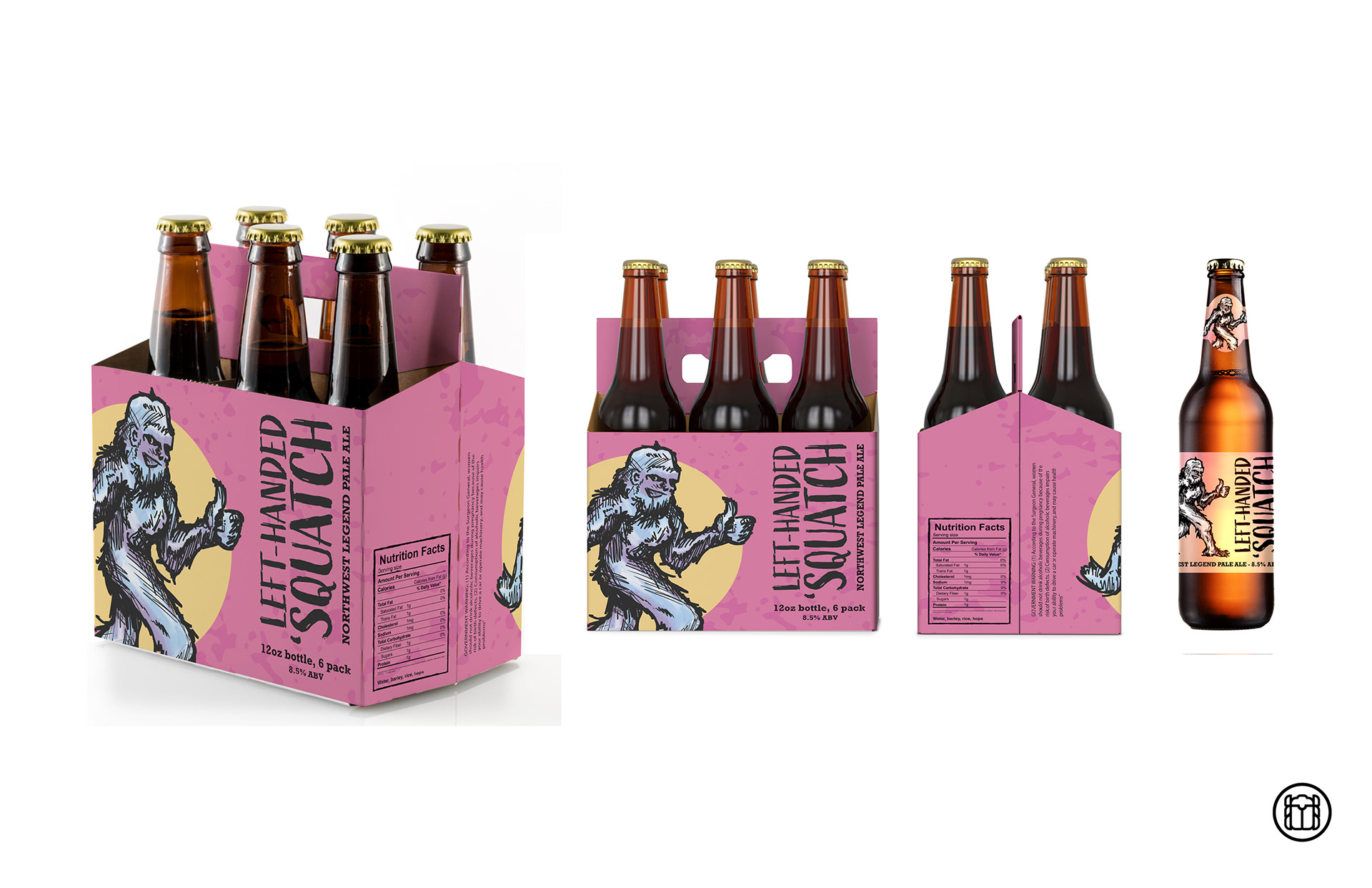
6 Pack Container and Bottle
The System