
OCOIN Brand Refresh
The goal of this project was to refresh the logo and brand identity for OCOIN, the Oregon Coastal and Ocean Information Network.
OCOIN is a non-profit information network that connects various researchers, partner organizations, and the invested community to easily accessible coastal region research.
Designers on this project: Jadzia Jula, Ivy Parker, Emma Reeve, and Andrew Welsh
The System
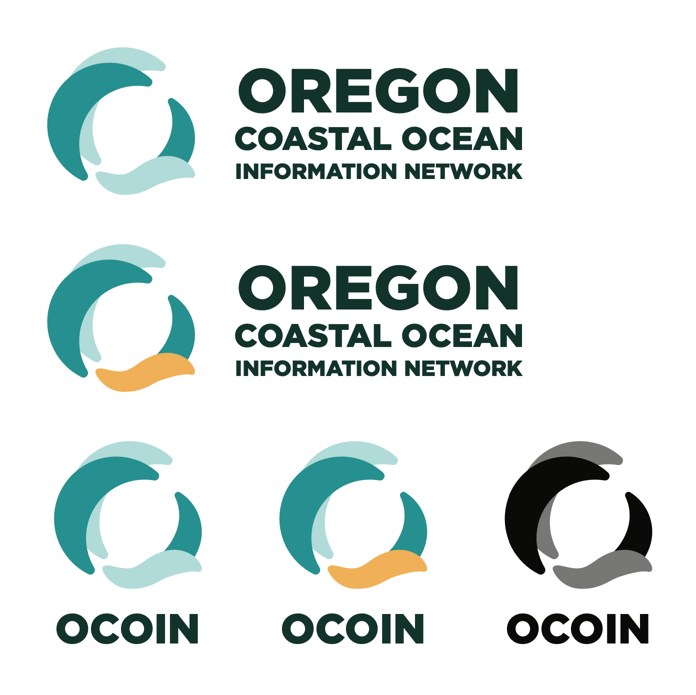
OCOIN positions itself as a community liaison between partner organizations and members of the community. As such, it must visually present itself in a way that communicates both community and professionalism.
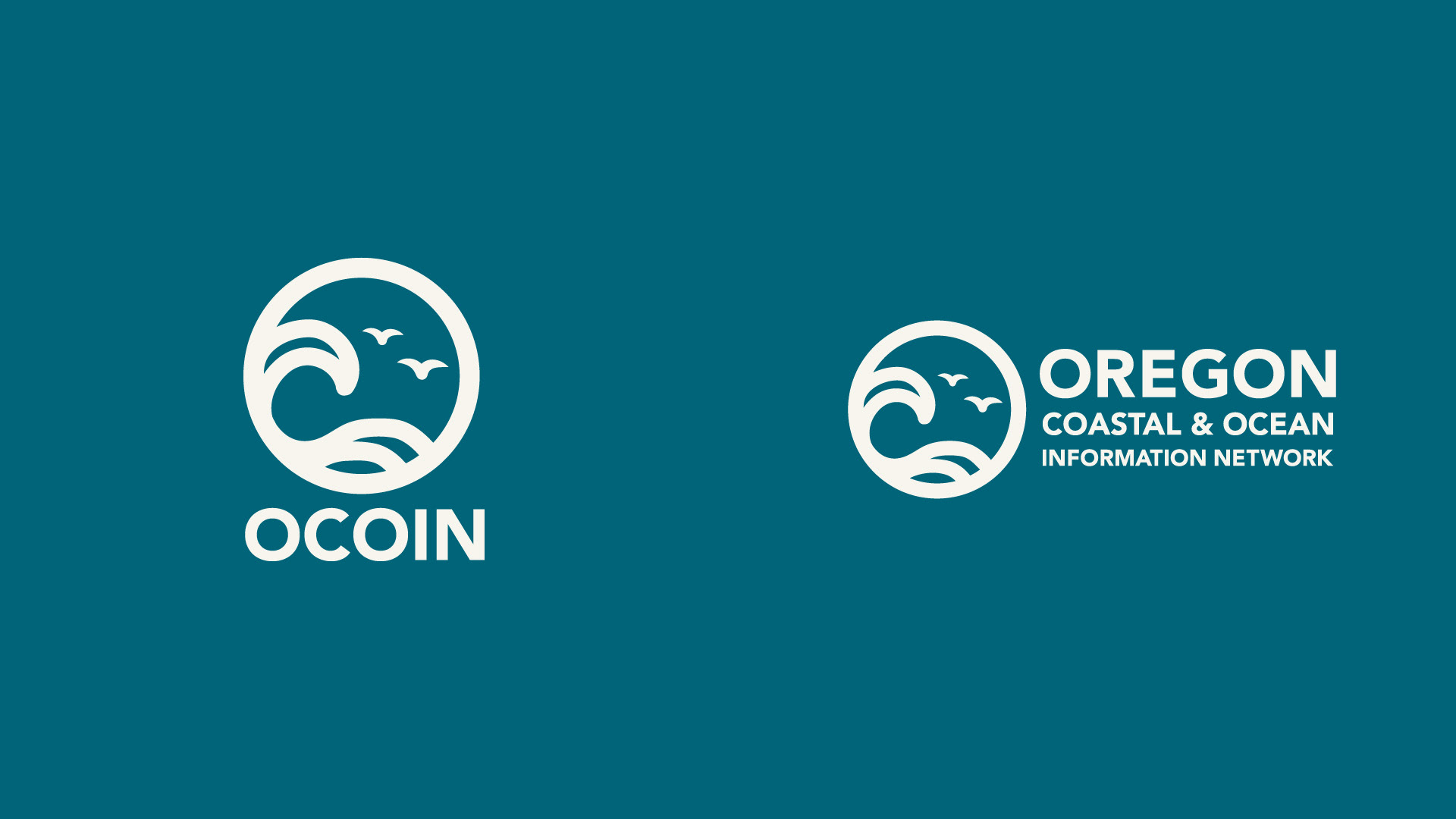
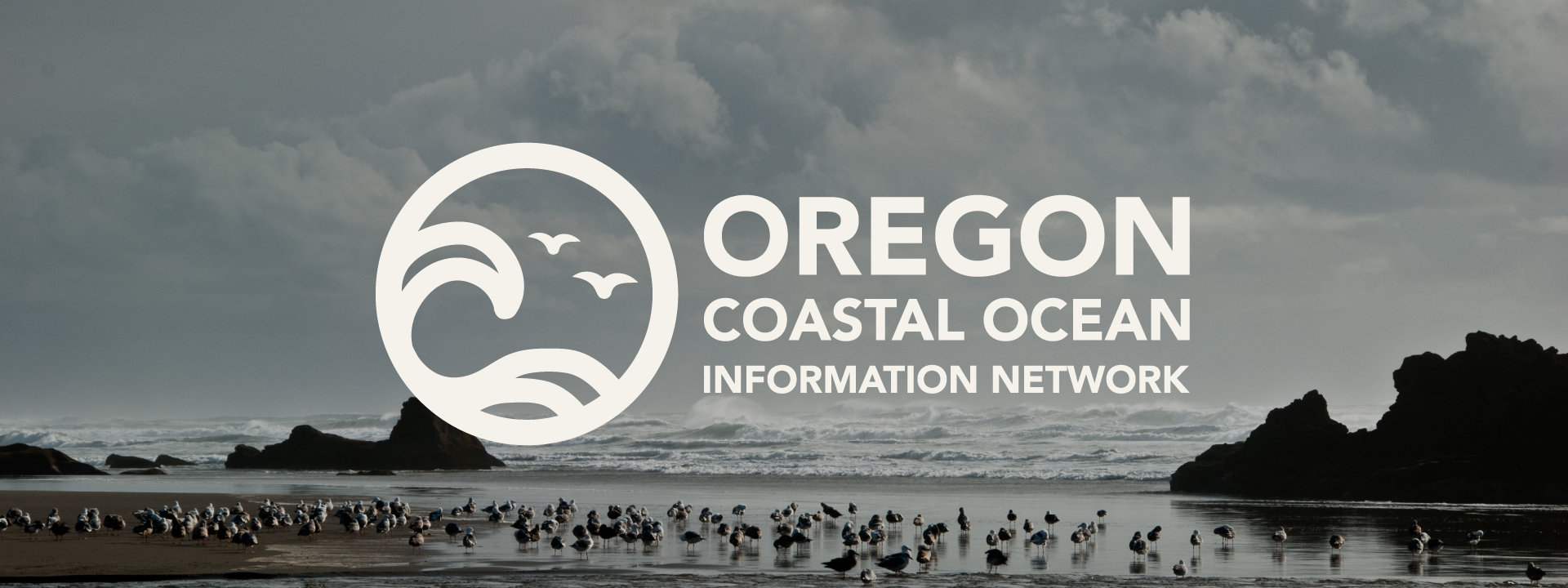
The logomark depicts coastal-ocean imagery, suggesting the ecosystems that OCOIN's partner organizations conduct research in It is clean, minimal, and welcoming, yet authoritative; providing a pleasant experience for community members, as well as communicating knowledge and expertise in research fields.
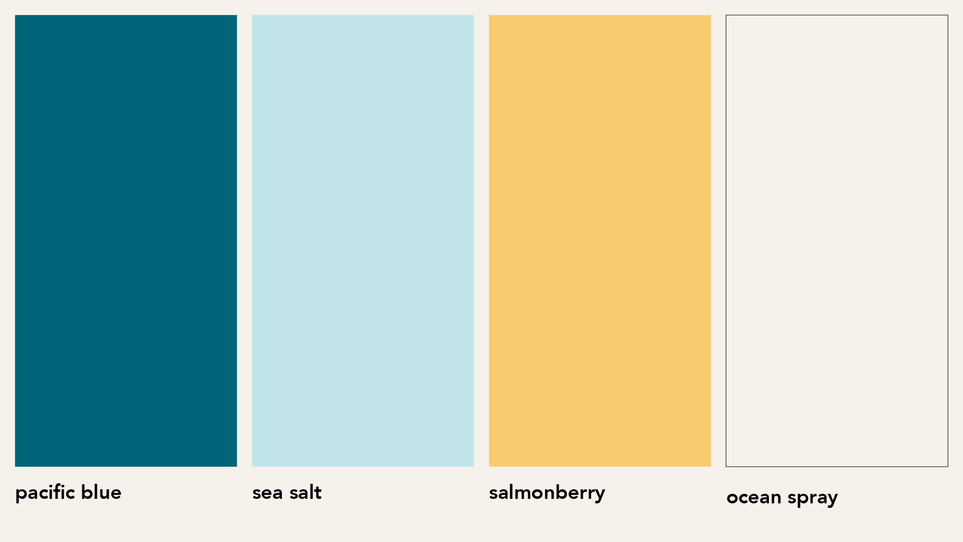
The brand colors are modeled after Oregon coastal region ecosystems. The simpler palette evokes a more refined presence, yet uses its level of saturation to retain its welcoming feeling.
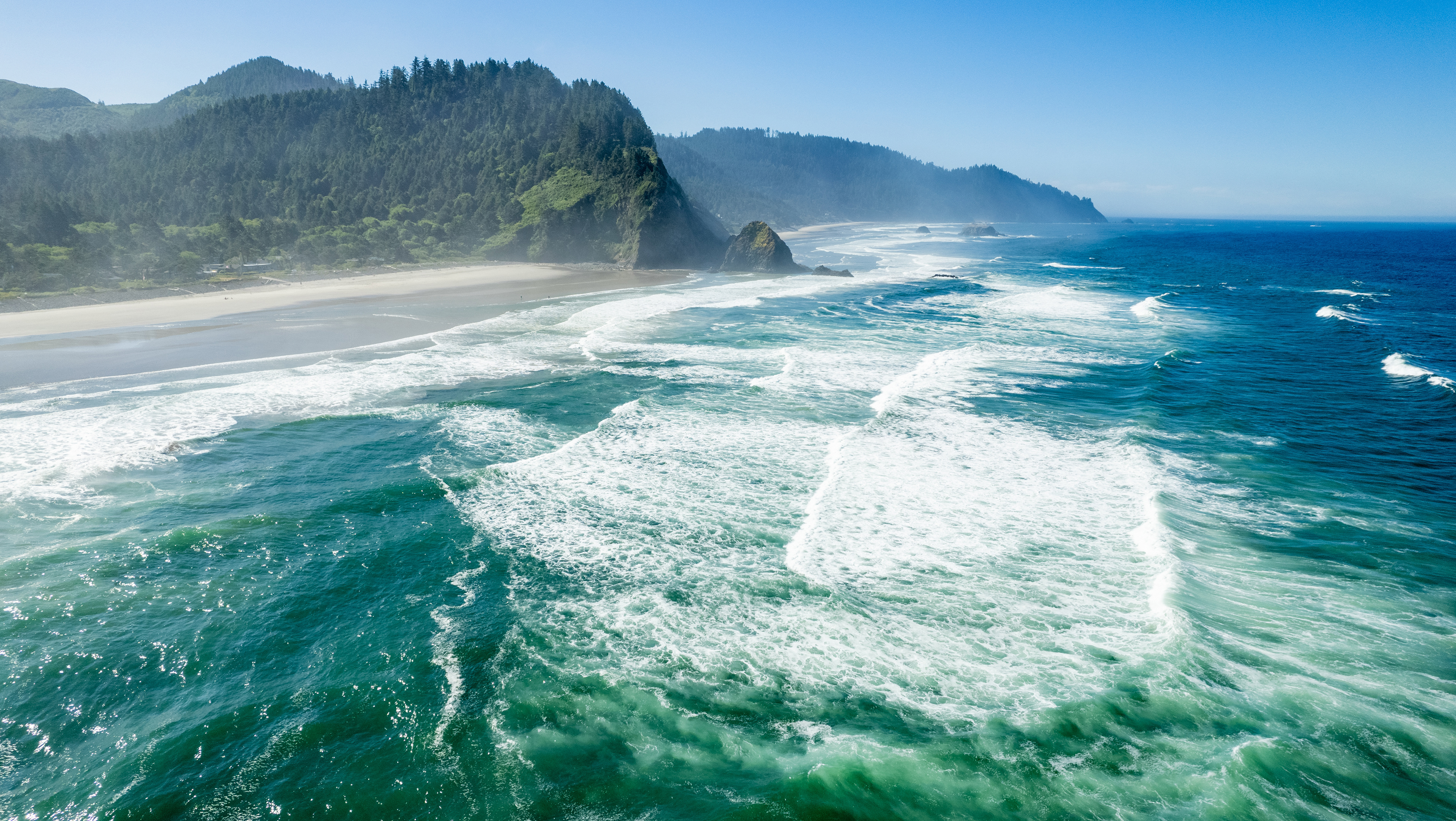
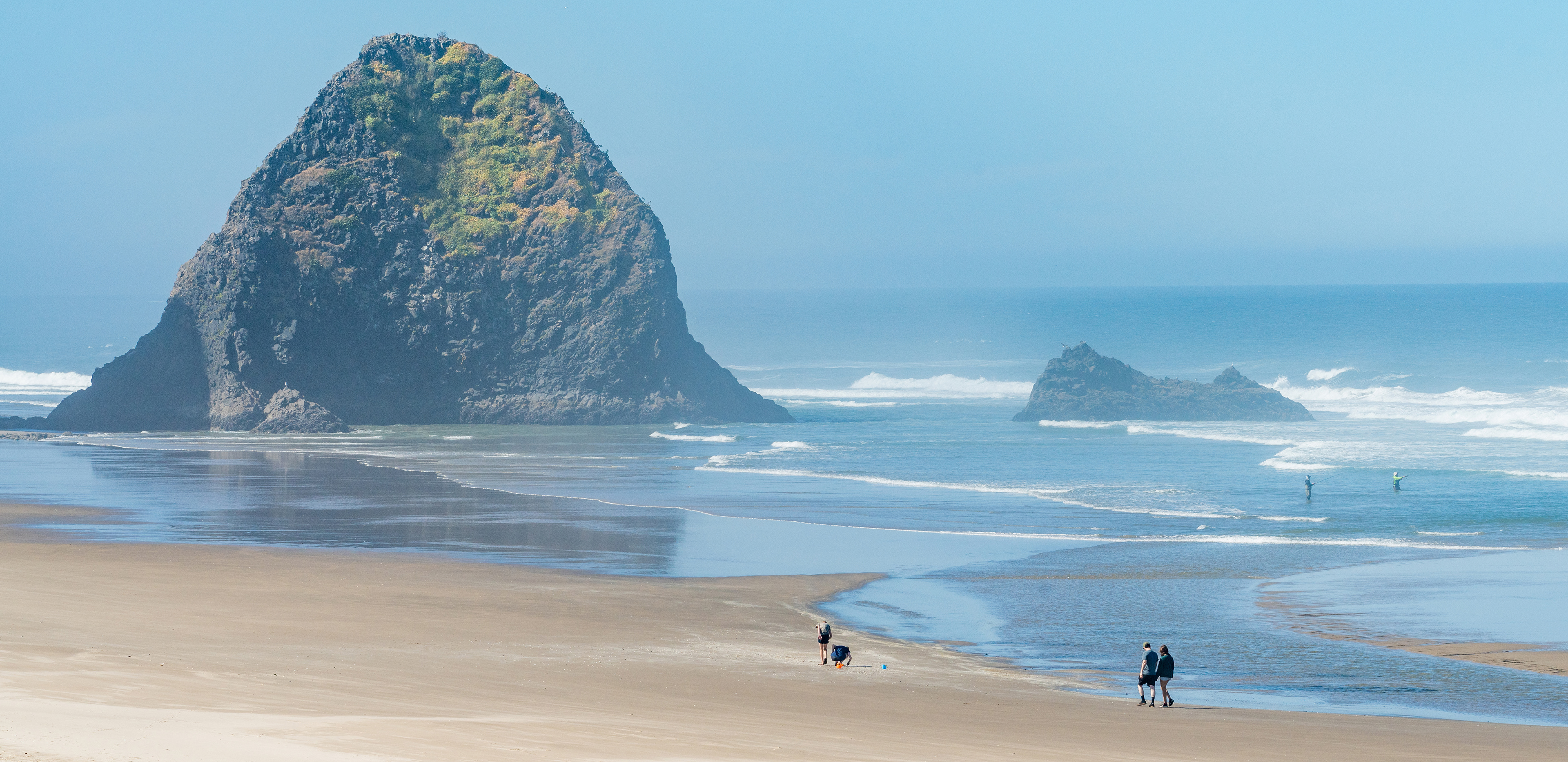
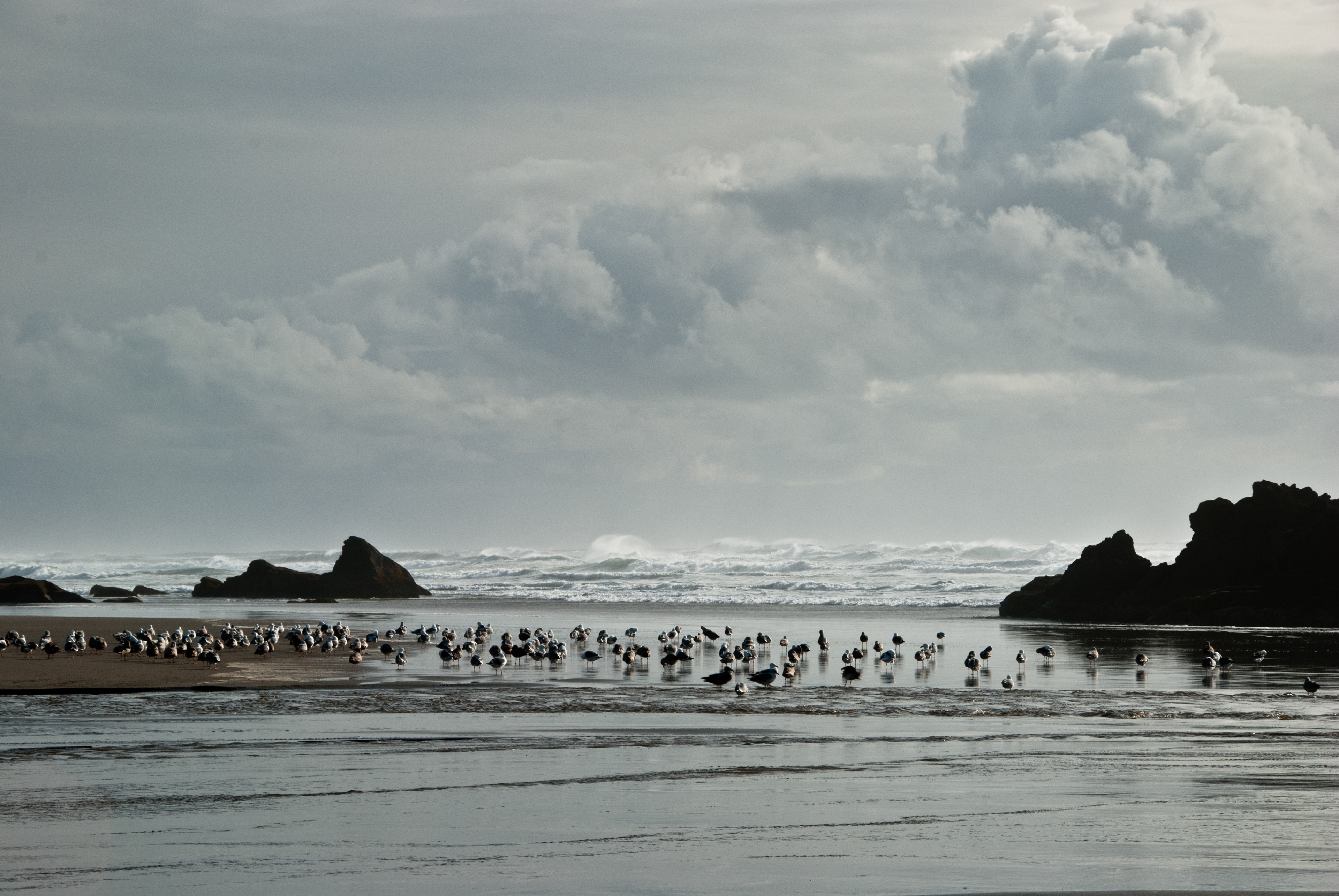
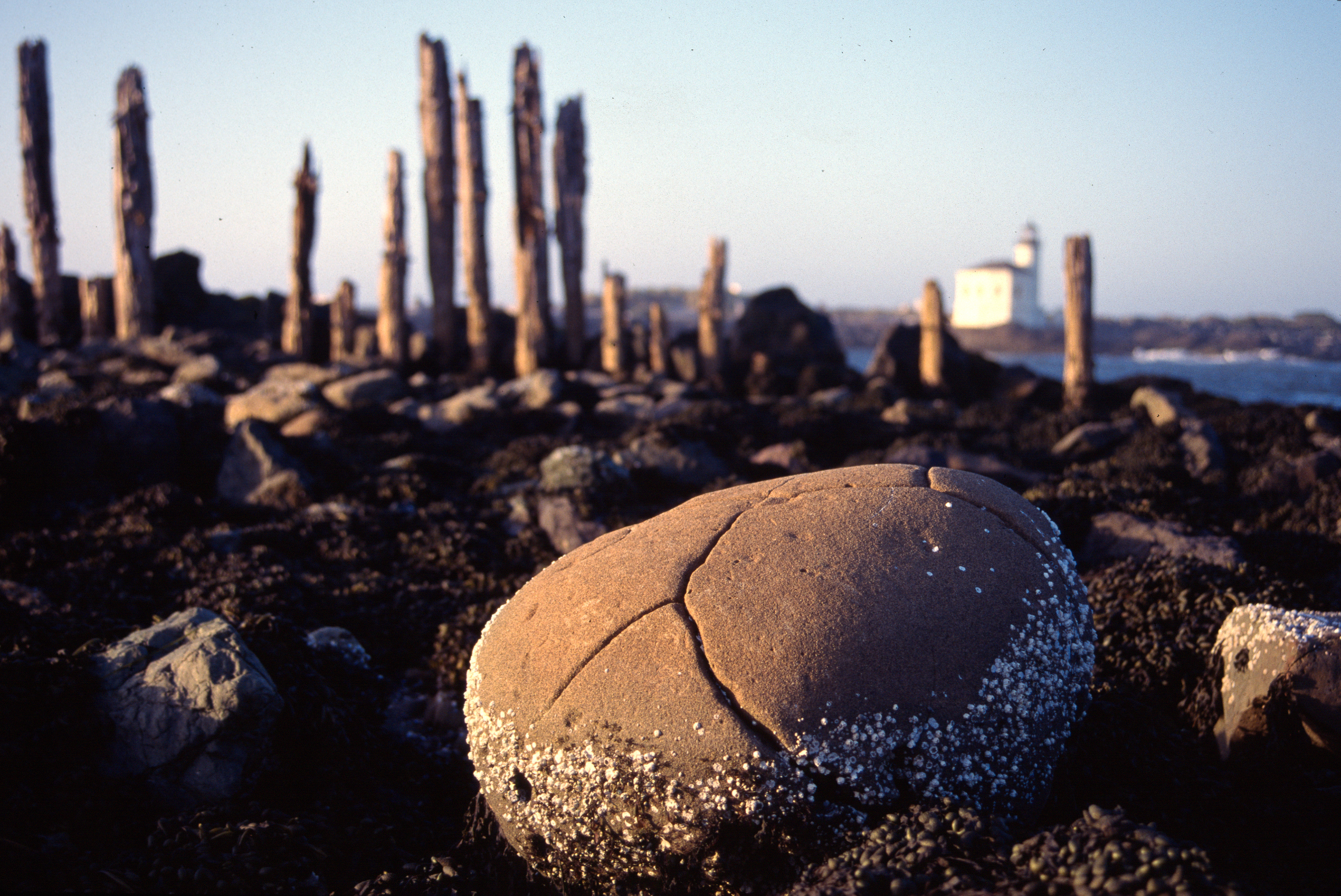
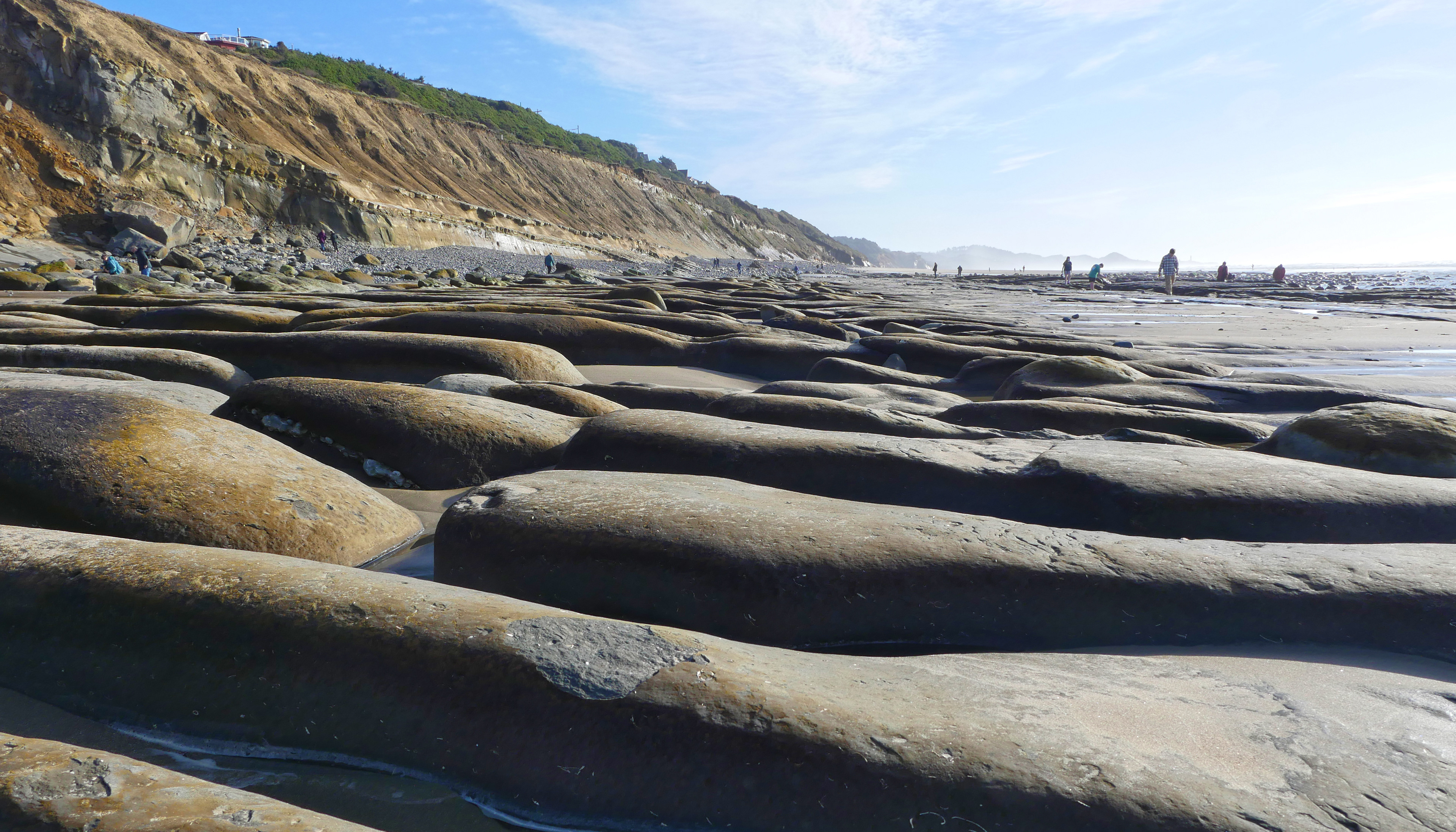

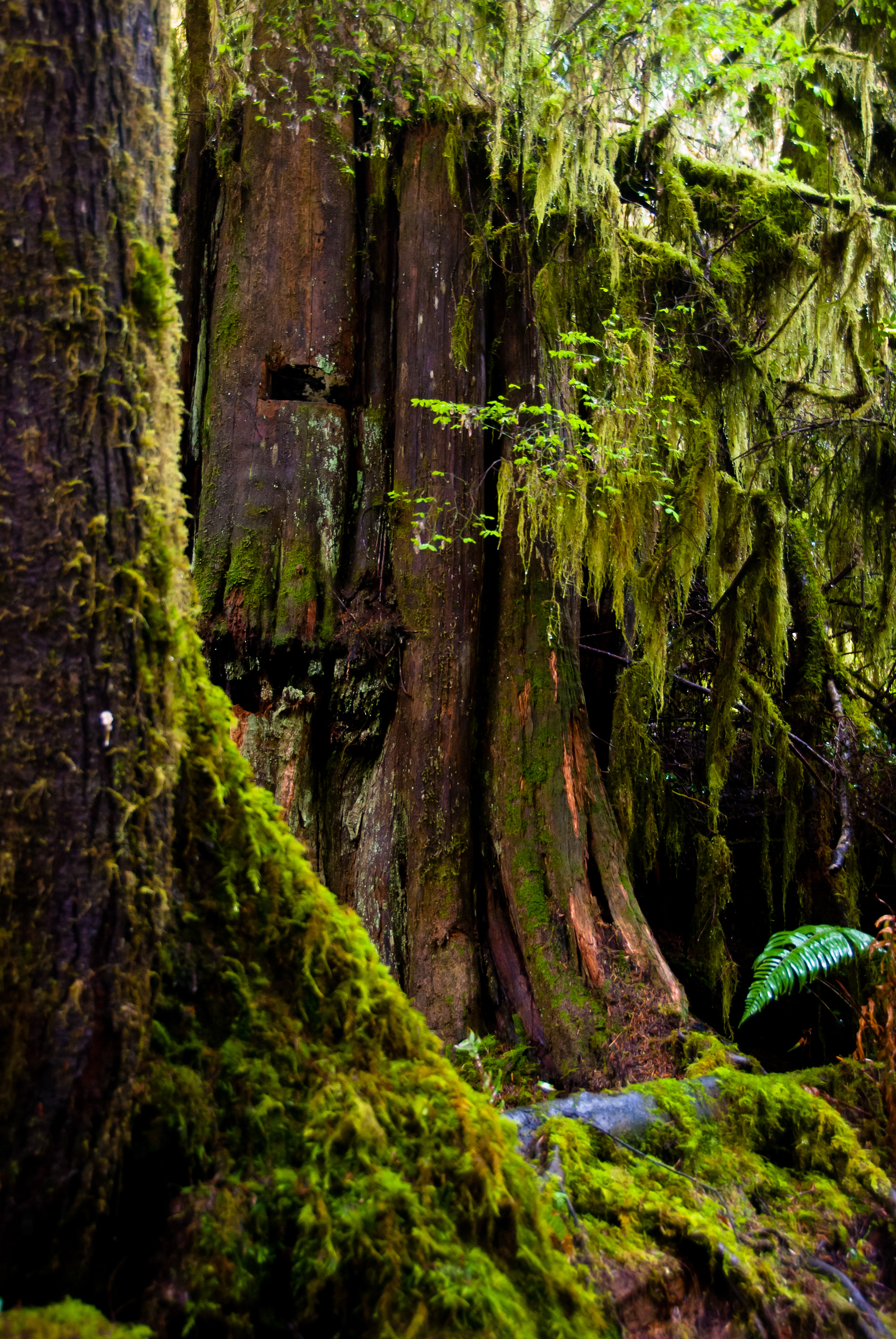
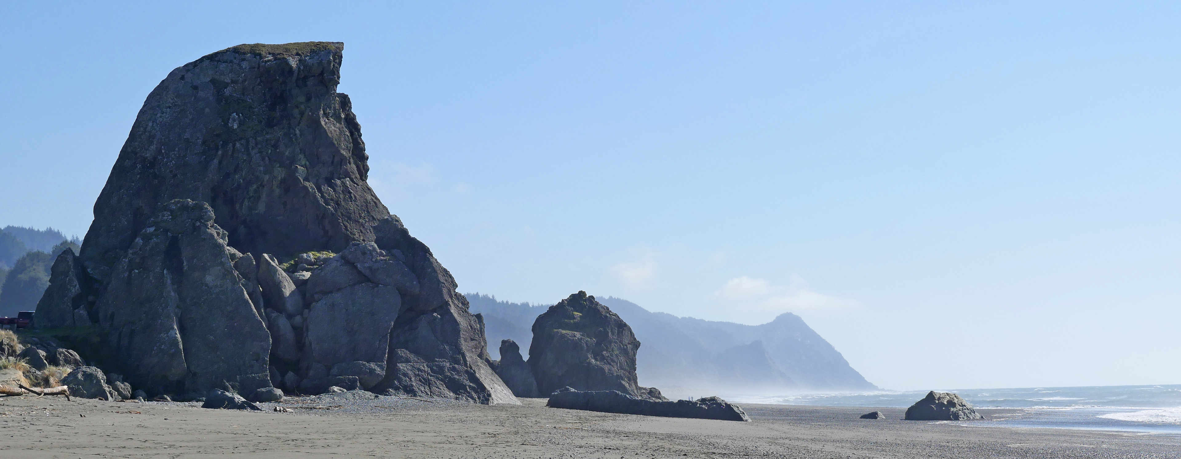
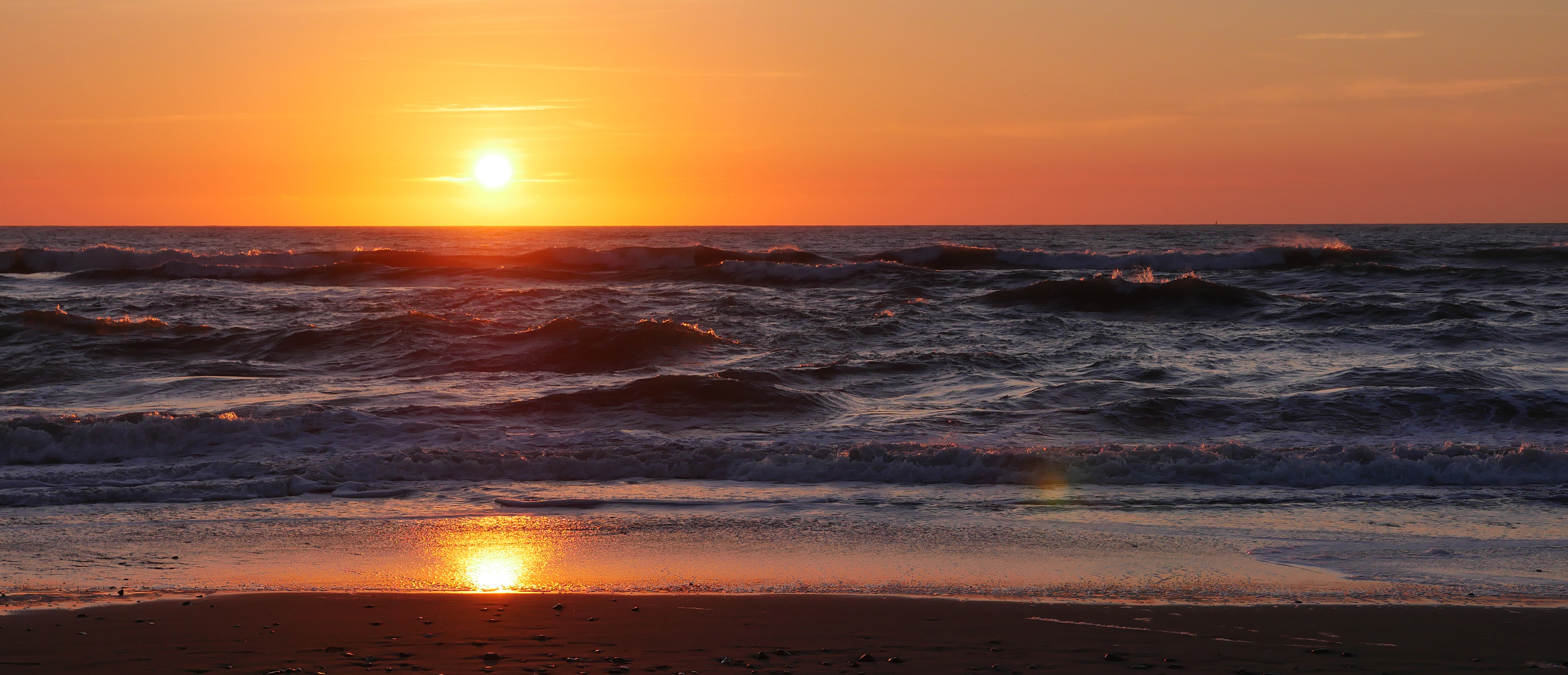
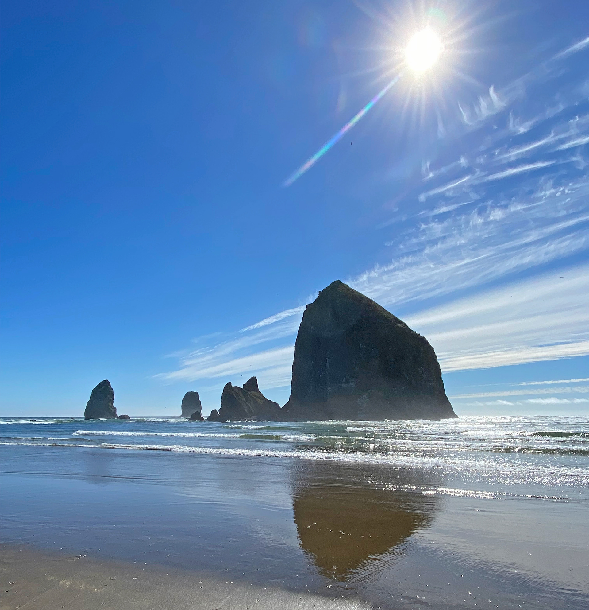
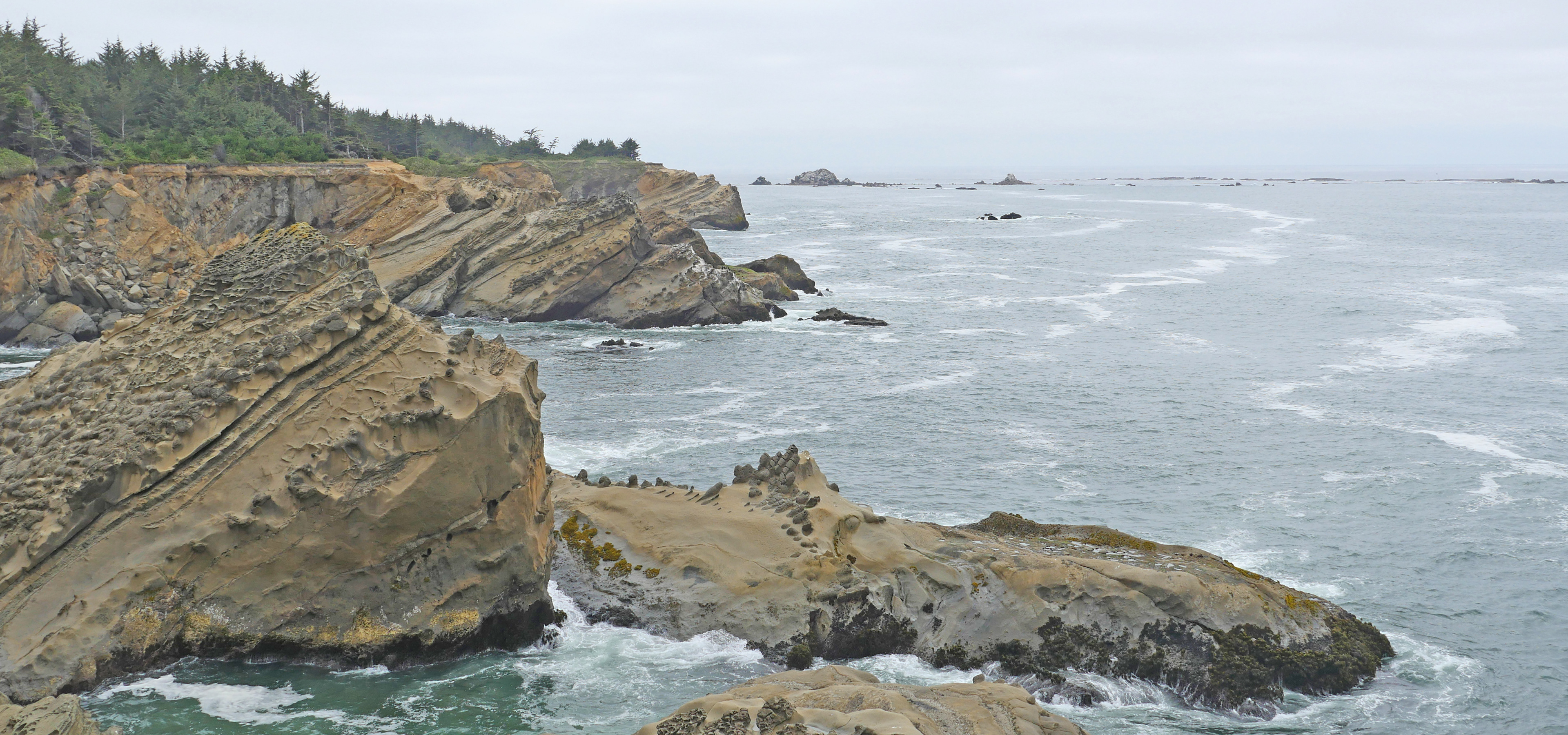
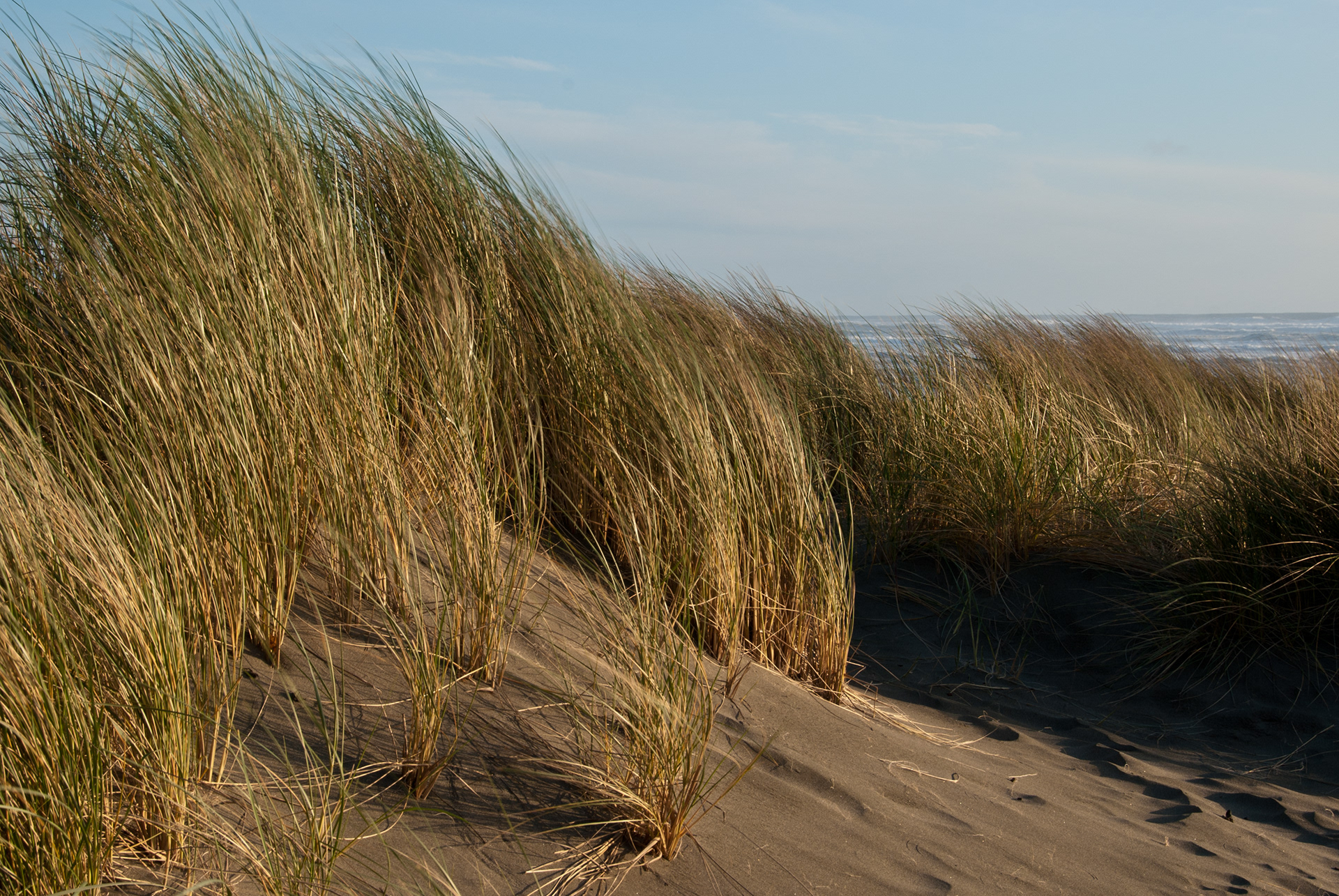

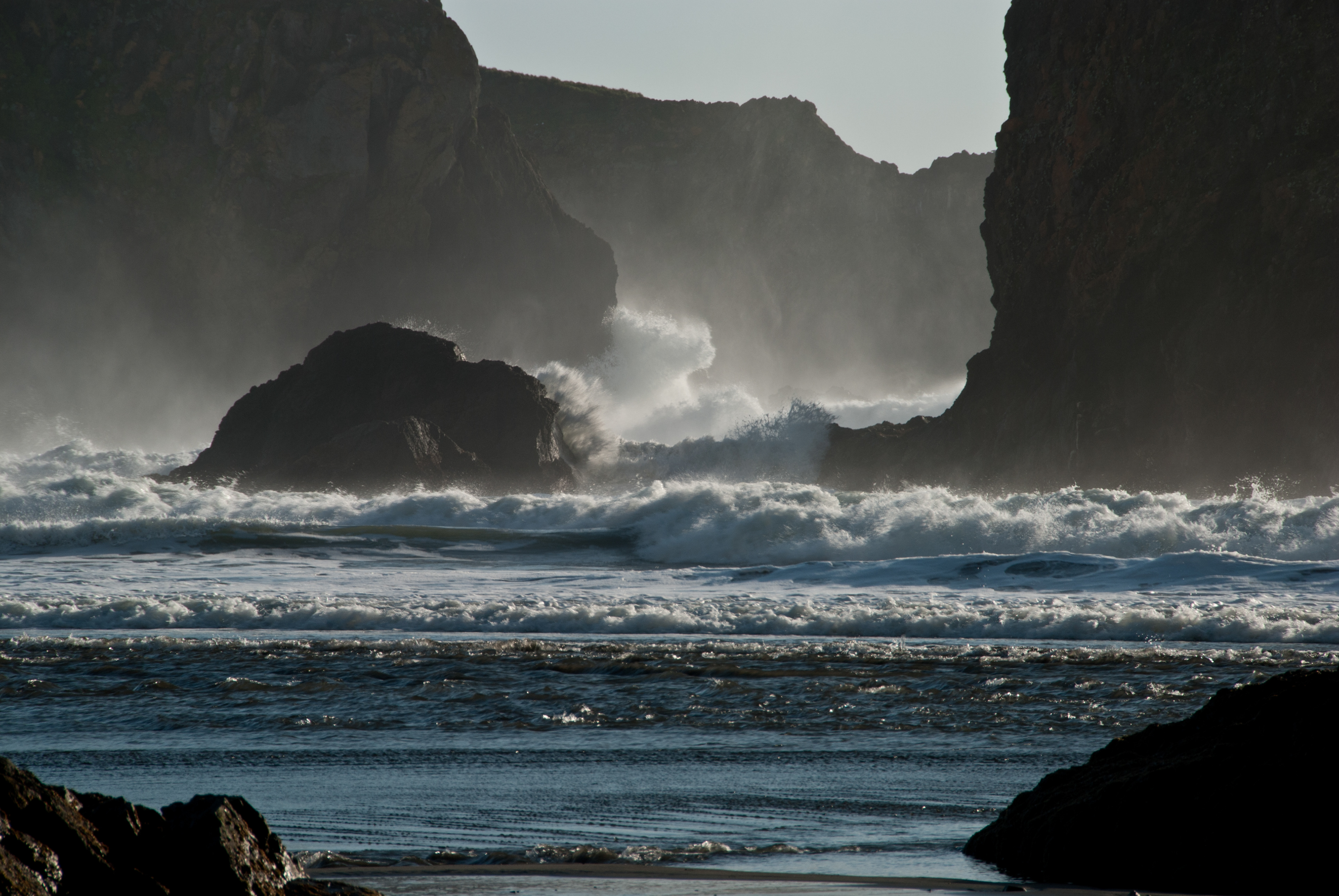
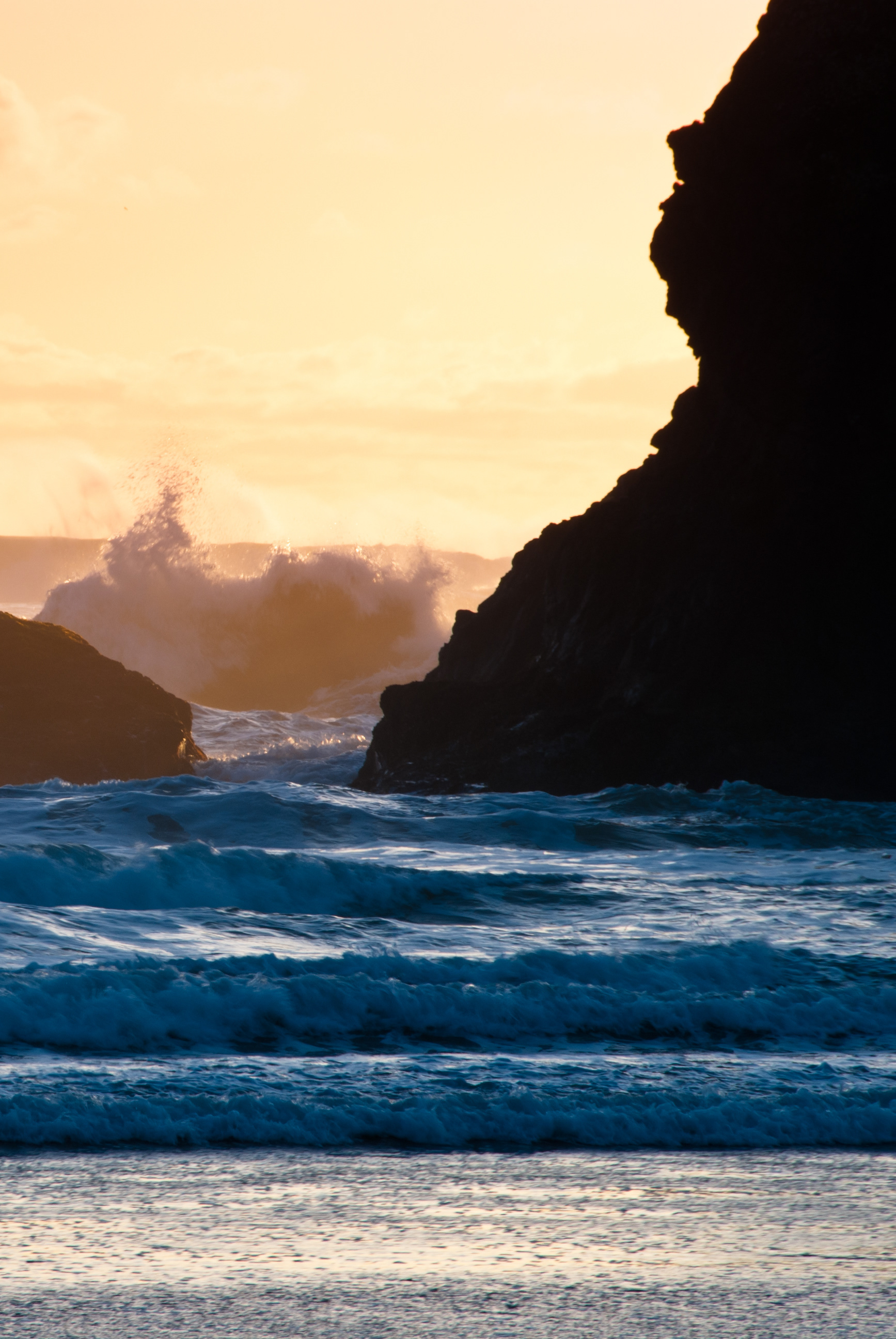
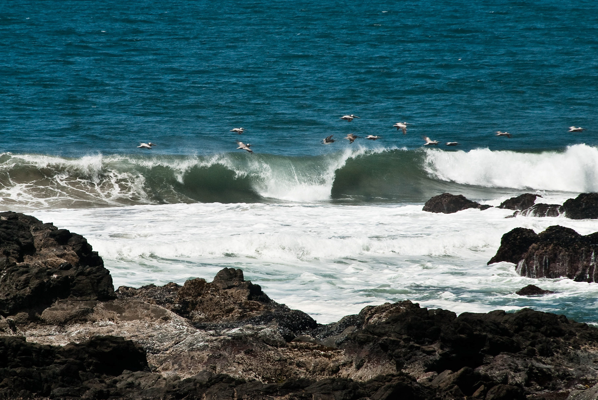
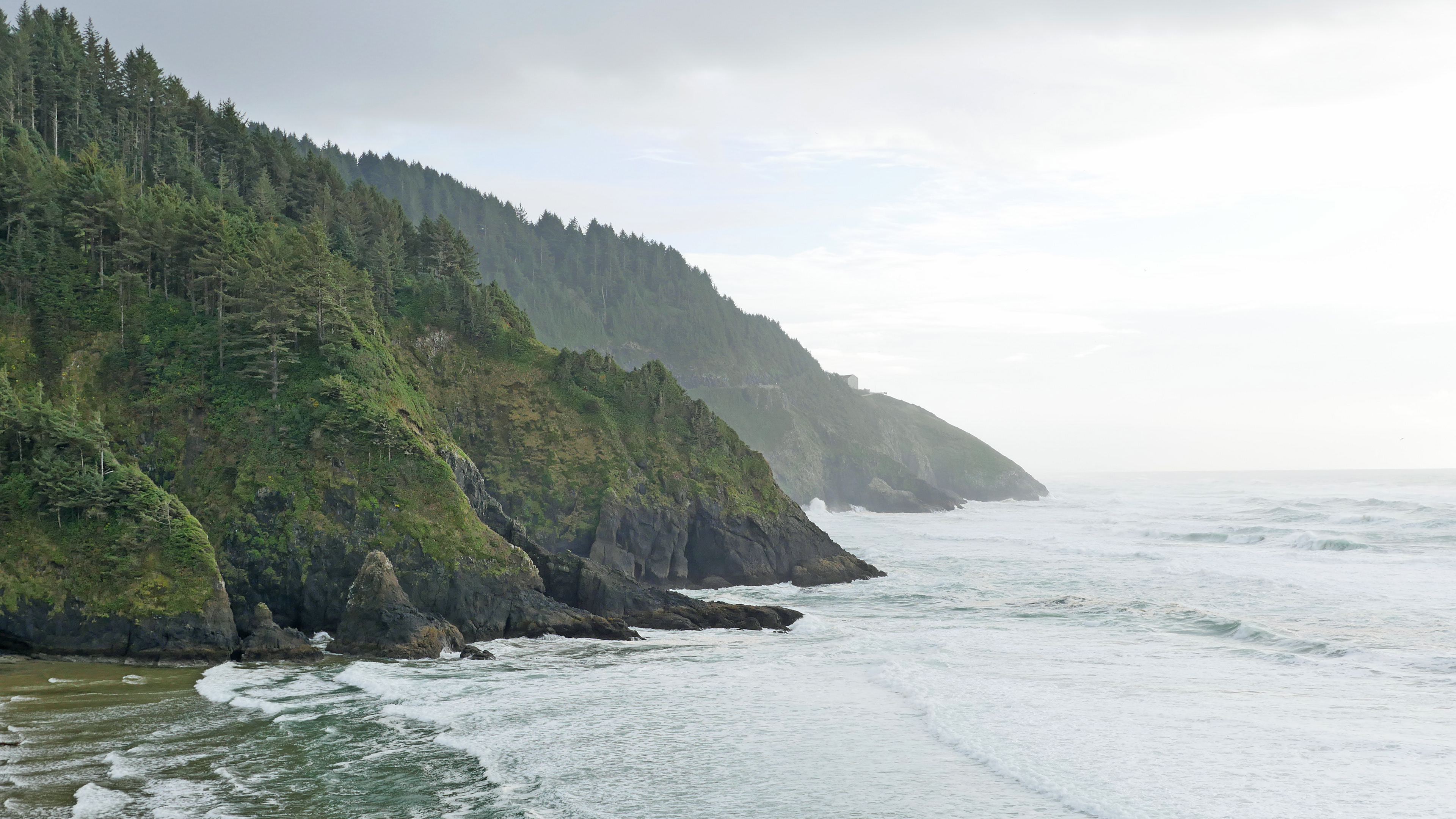
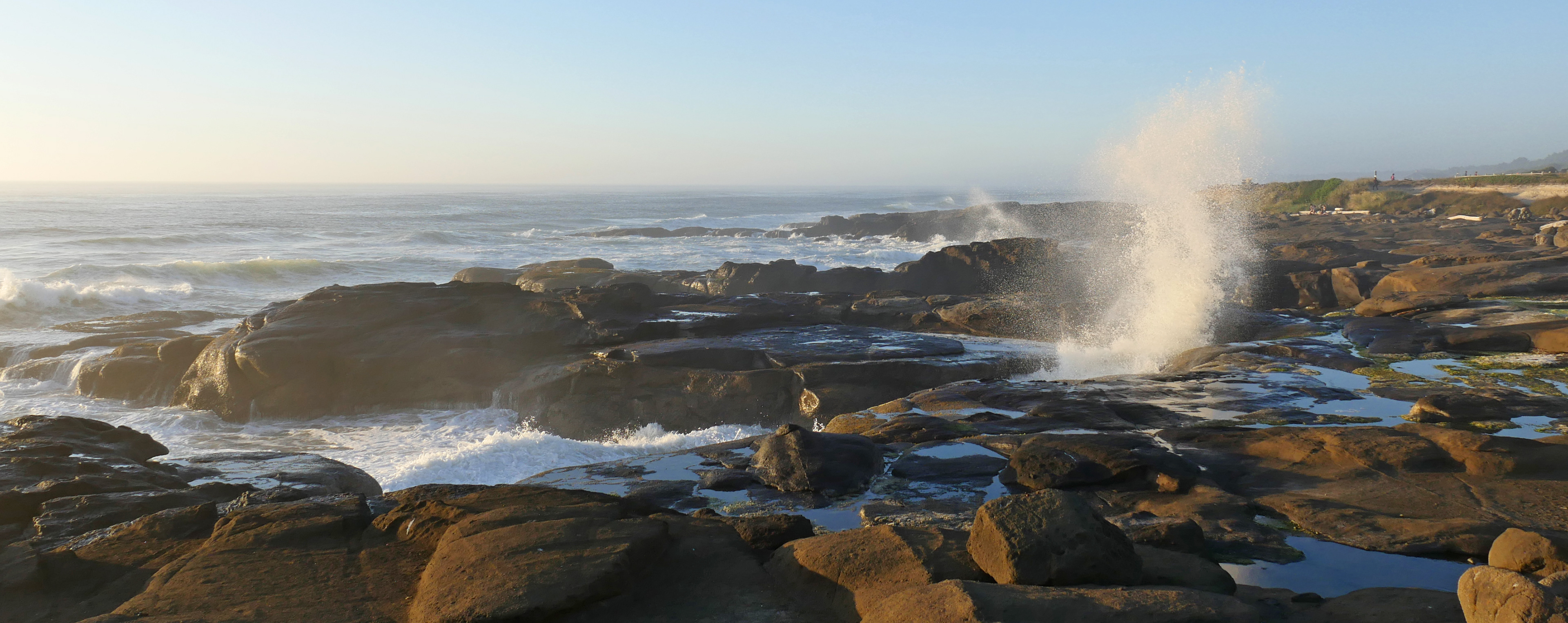
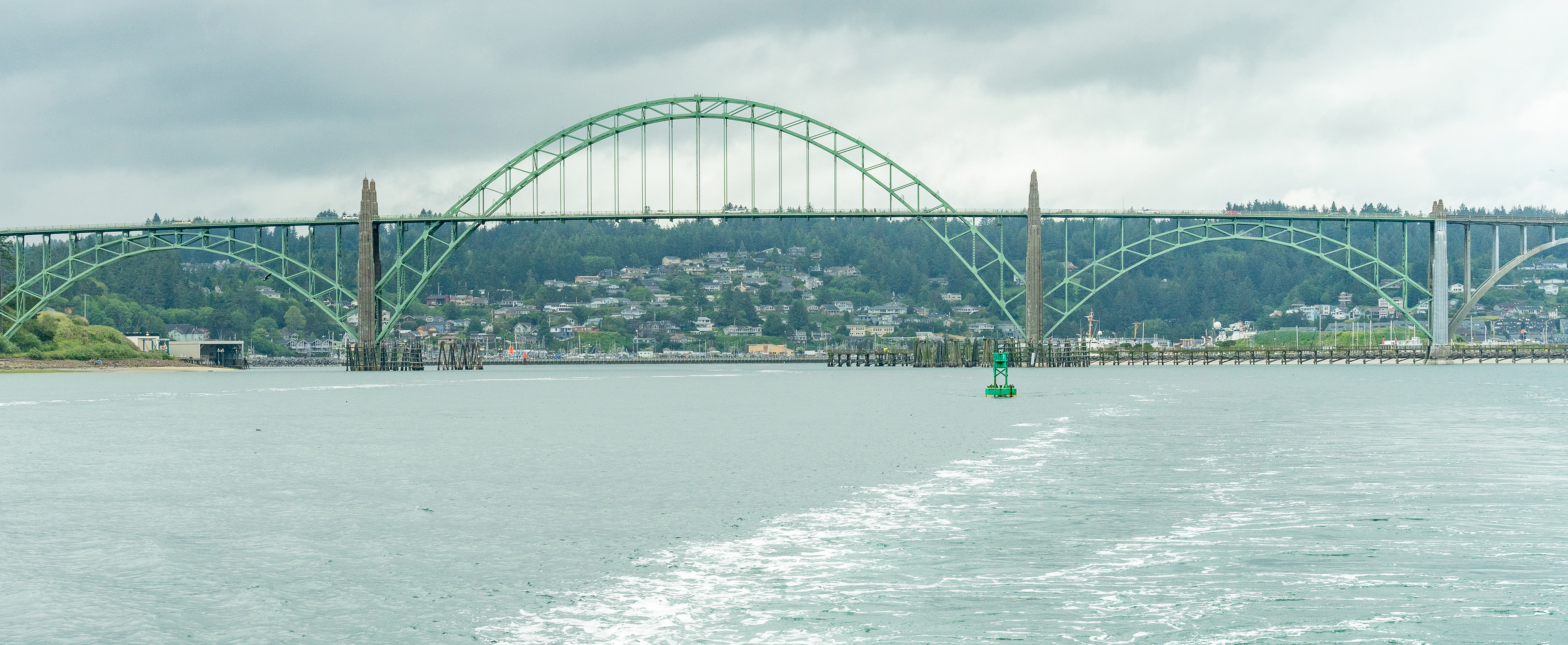
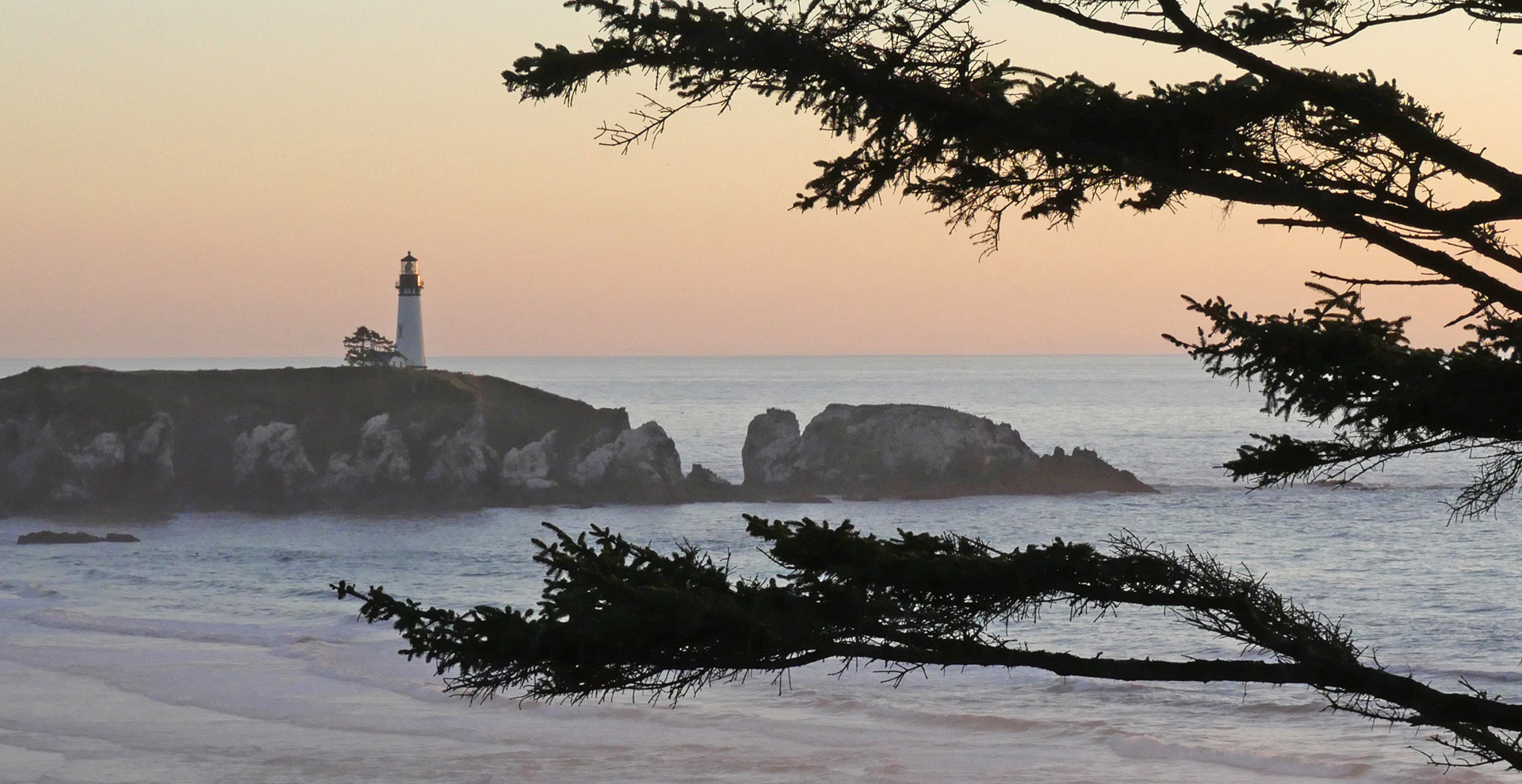
In combination with its logomark and palette, the updated OCOIN brand utilizes Oregon coastal photography. The photography calls to the wide range of environments and ecosystems that are researched by OCOIN's partner organizations. All images are sourced from Oregon Sea Grant's Flickr page.
Process
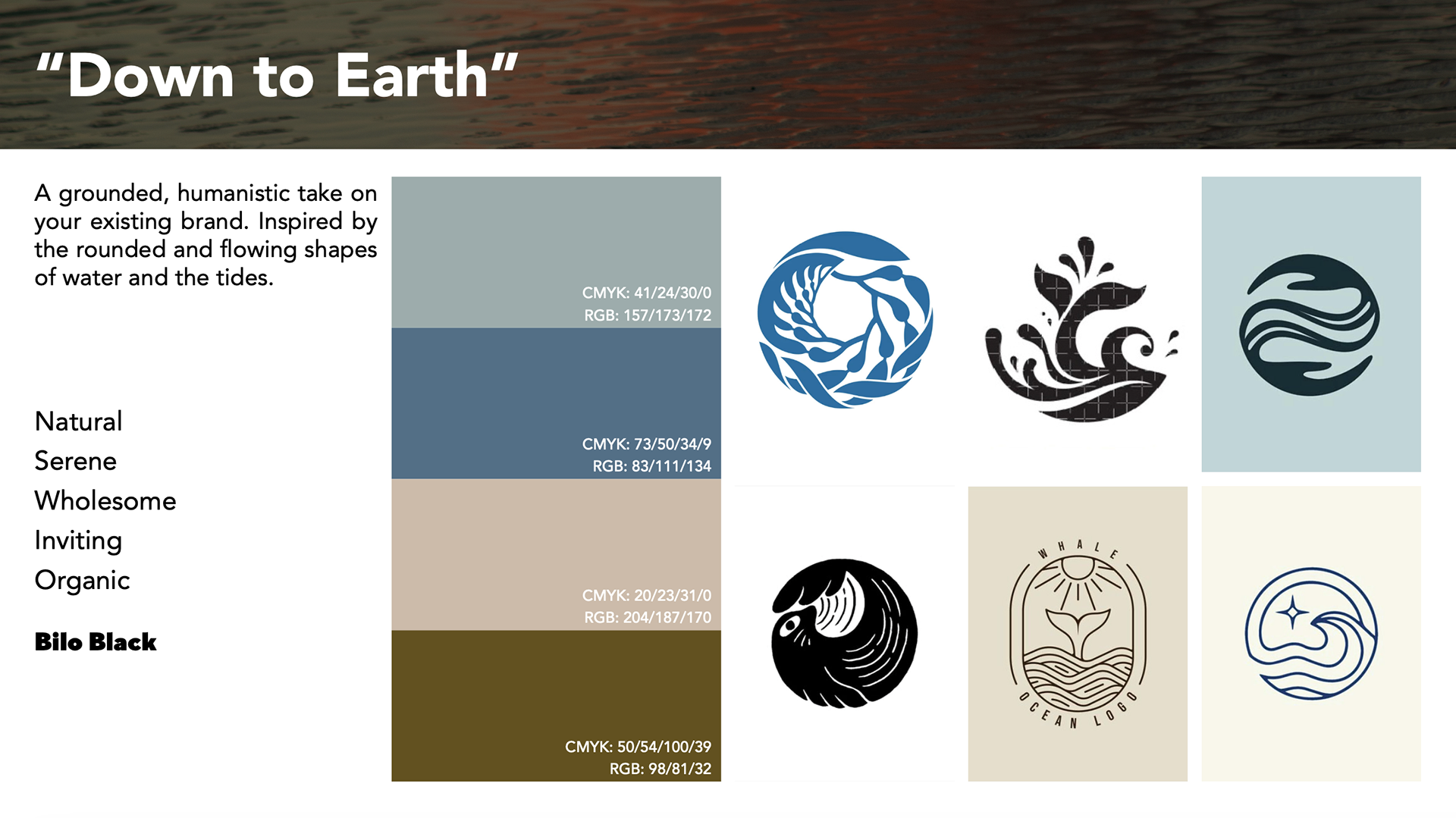
"Down to Earth" Territory, curated by Ivy Parker
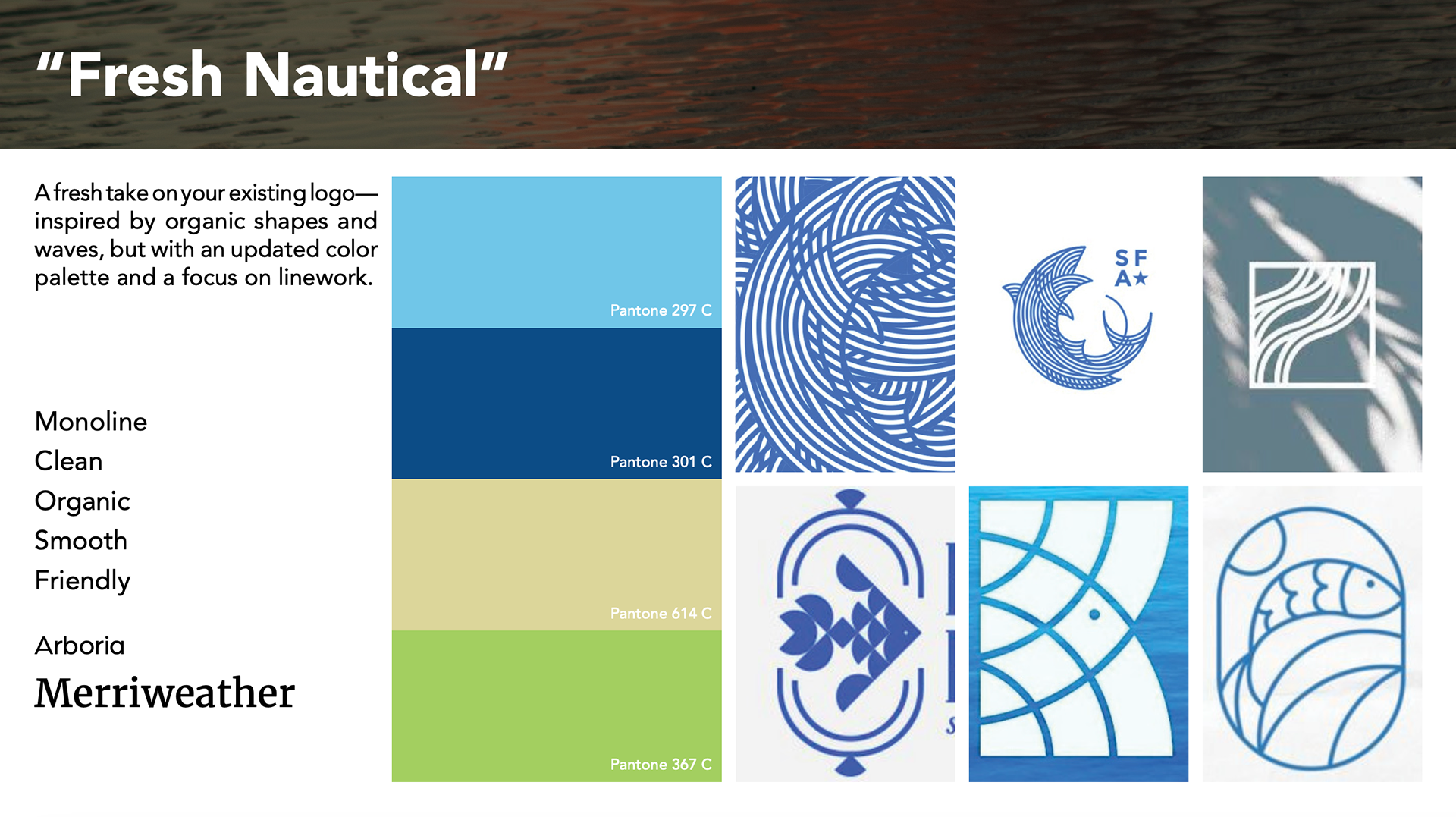
"Fresh Nautical" Territory, curated by Emma Reeve
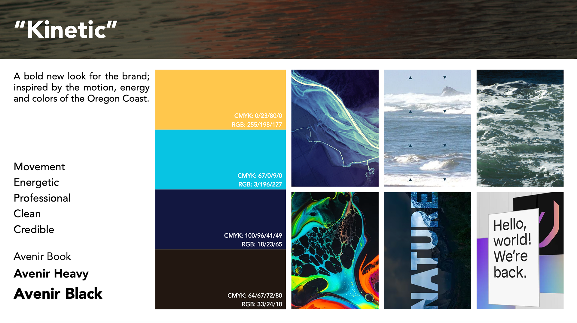
"Kinetic" Territory, curated by Andrew Welsh
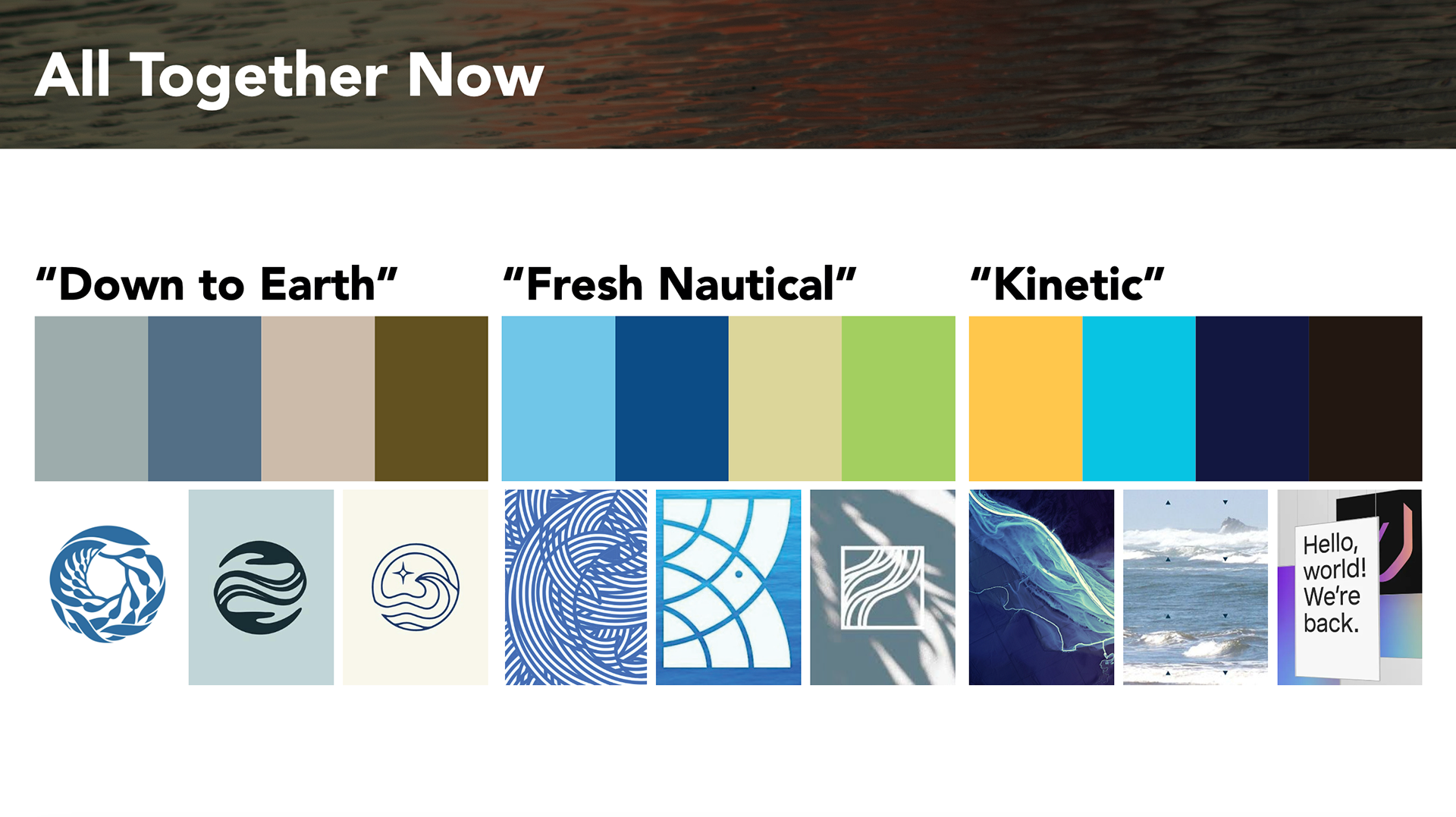
All initial territories, side by side
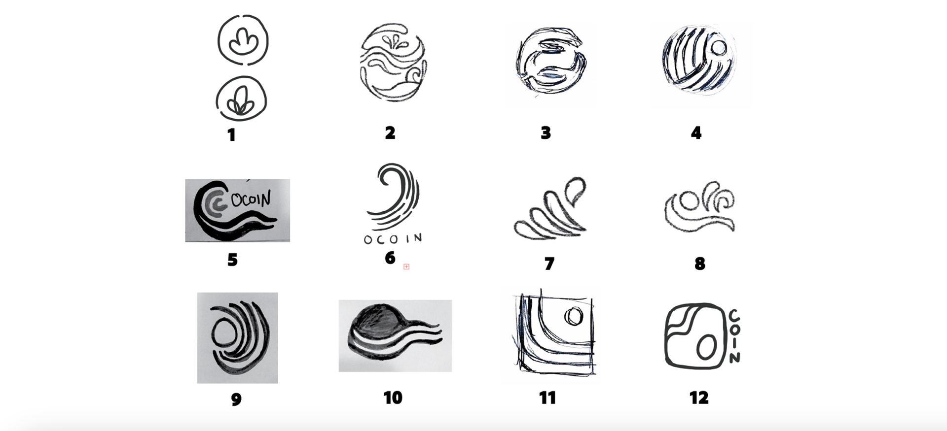
Logo sketches by all members of the design team.
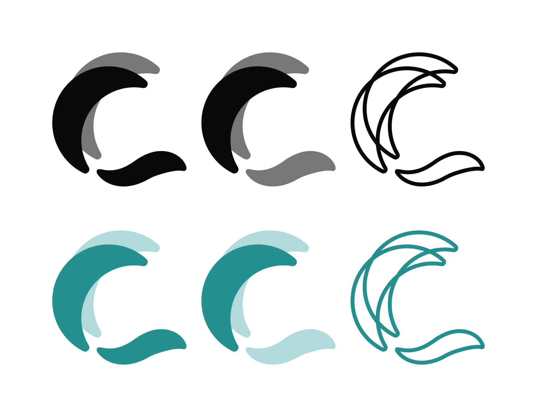
Round 2 Logo Revision, designed by Andrew Welsh
Round 2.5 Logo Revision, designed by Andrew Welsh
The design process for this brand refresh was done in rounds, starting with a presentation of different possible directions, called "Territories". A Territory is like a mood board, but a little more in-depth, communicating a more comprehensive idea of the direction a design can take.
After several rounds of meeting and revision, OCOIN and the design team moved to combine the graphic style of the "Down to Earth" territory, palette of the "Fresh Nautical" territory, and the typography of the "Kinetic" territory, all with revisions. After several more rounds of communication, the final logo, palette, and brand voice took form.